certified-app · bluesky-comparison-redesign
Certified — Bluesky-inspired UX/UI redesign + audit

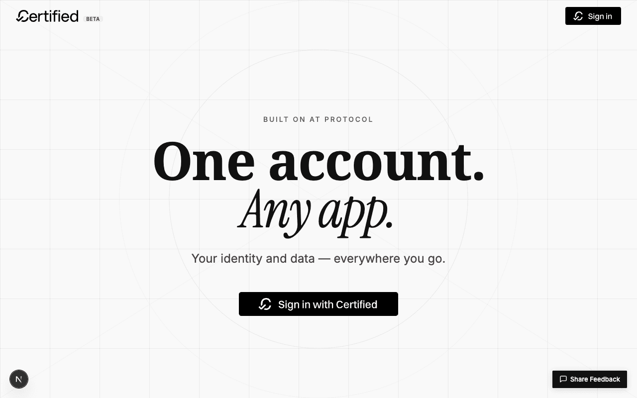
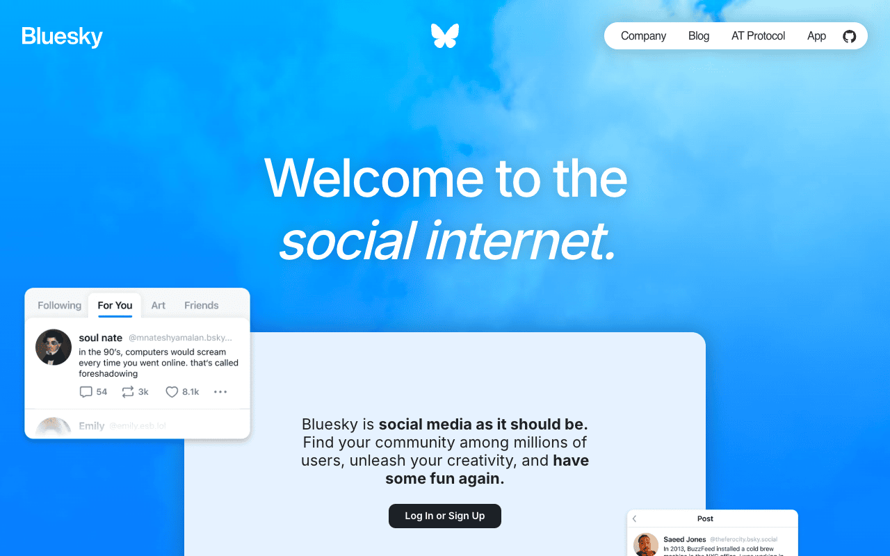
Compared certified.app's pure-grayscale editorial landing against
Bluesky's blue-forward marketing site,
introduced a Certified-blue brand accent, and shipped a six-section
redesign of /welcome. Build + lint clean; a handful of
out-of-flow pages still wear the old navy palette and are filed as
follow-up.
Headline result
Headline. The original /welcome read as a fine
editorial layout but had no brand color, no visual entry point on
the bento grid, greyscale partner logos that looked like placeholders,
a sparse "How it works", and a closing CTA that was a literal repeat
of the hero. After the redesign, a single Certified-blue
token (#1d4ed8) carries through the page from the hero
chip → tinted icon circles → numbered step rings → partner-card
hover affordance → blue-gradient closing CTA → footer protocol pill.
Bluesky-inspired in posture (clear brand color, big type,
pill chips, generous whitespace) but deliberately distinct in
palette (a deeper notarial blue, not Bluesky's electric
#0085FF) so the two products stay visually separable
even though they share the AT Protocol stack.
Comparison — Bluesky vs. certified.app (before)
I started by parking screenshots of the two products side by side, so the redesign was anchored against an actual reference rather than vibes. Bluesky's marketing site does three things particularly well that certified.app's before state did not:
| Aspect | certified.app (before) | Bluesky (bsky.social/about) | Redesign target |
|---|---|---|---|
| Brand color | Pure grayscale (--color-accent: #5e5e5e) | Electric blue #0085FF + sky gradient | Introduce Certified-blue #1d4ed8 — deeper, more notarial, distinct from Bluesky |
| Hero | Editorial type + grid pattern, plain UPPERCASE label | Sky-cloud gradient, butterfly mark, oversized italic | Add radial blue glow + pill chip + trust micro-list |
| Cards / mockups | Flat white bento with tiny black stroke icons | Floating UI mockups in color, depth, rounded | Tinted icon circles, brand-fill highlight card to anchor the eye |
| Step indicators | Sparse italic numerals (01 02 03) drifting in space | n/a (different IA) | Circled brand-blue numbers + vertical connector line |
| Partner logos | Greyscale, faded names — reads as placeholder | n/a | Always-color logos, real card surface, brand-blue ring on hover |
| Closing CTA | Plain off-white — literally a repeat of the hero | n/a | Bold blue gradient w/ trust microcopy, distinct closing moment |
| Footer | Single thin row (3 inline links) | Multi-column site-wide | Multi-column (Product / Company / Legal) + protocol pill |
Section-by-section walkthrough
Each pair below is the same viewport on the same device, with my
local redesign branch swapped in via git stash for the
before shot and git stash pop for the after shot. Same
browser session, same dev server, no other variables.
1. Hero — brand chip + radial glow + trust microcopy
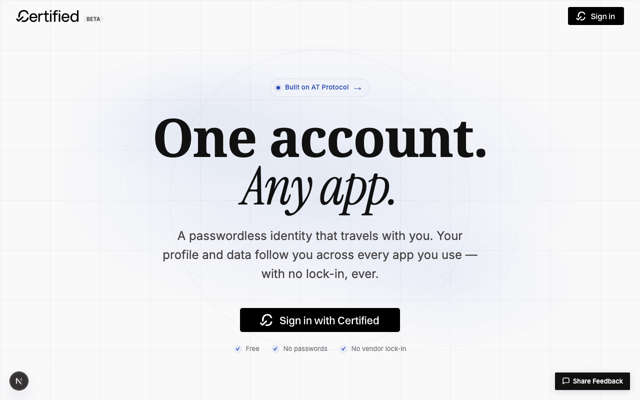
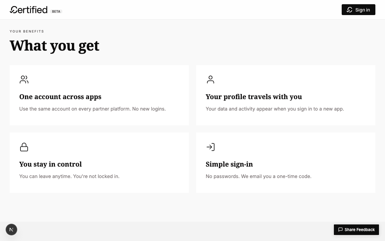
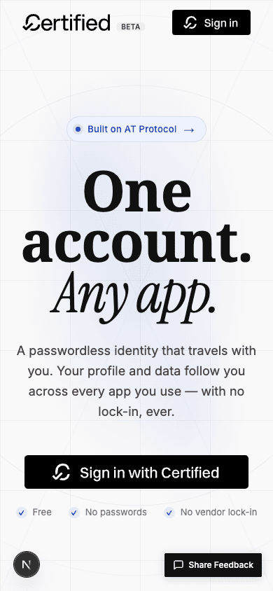
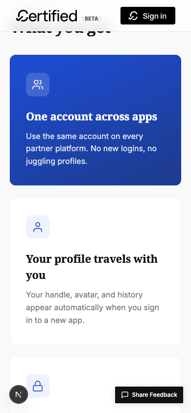
#built-for-trust. Soft radial blue glow sits behind the type. Subtitle now actually describes the product. Three trust pills (Free / No passwords / No vendor lock-in) sit under the CTA — pre-empts the most common objection before the user clicks.2. "What you get" bento — brand highlight + tinted icon circles
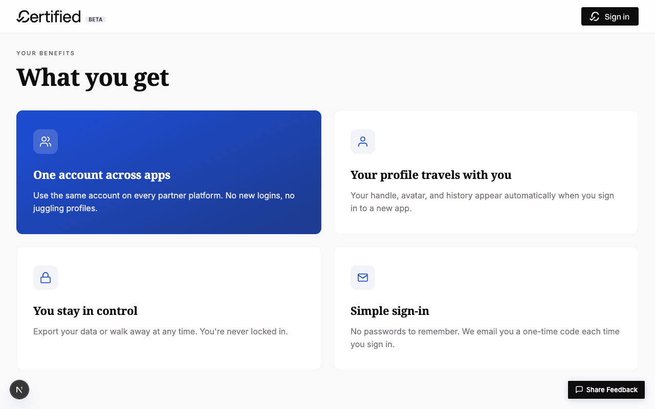
3. "How it works" — circled numbers + connector line
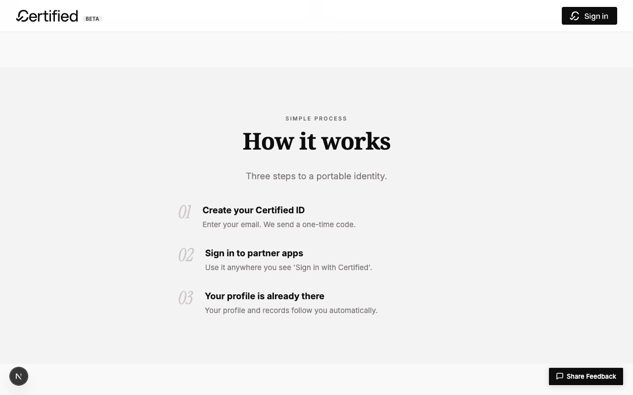
01 02 03) in --color-outline-variant floating loose, no visual binding between steps.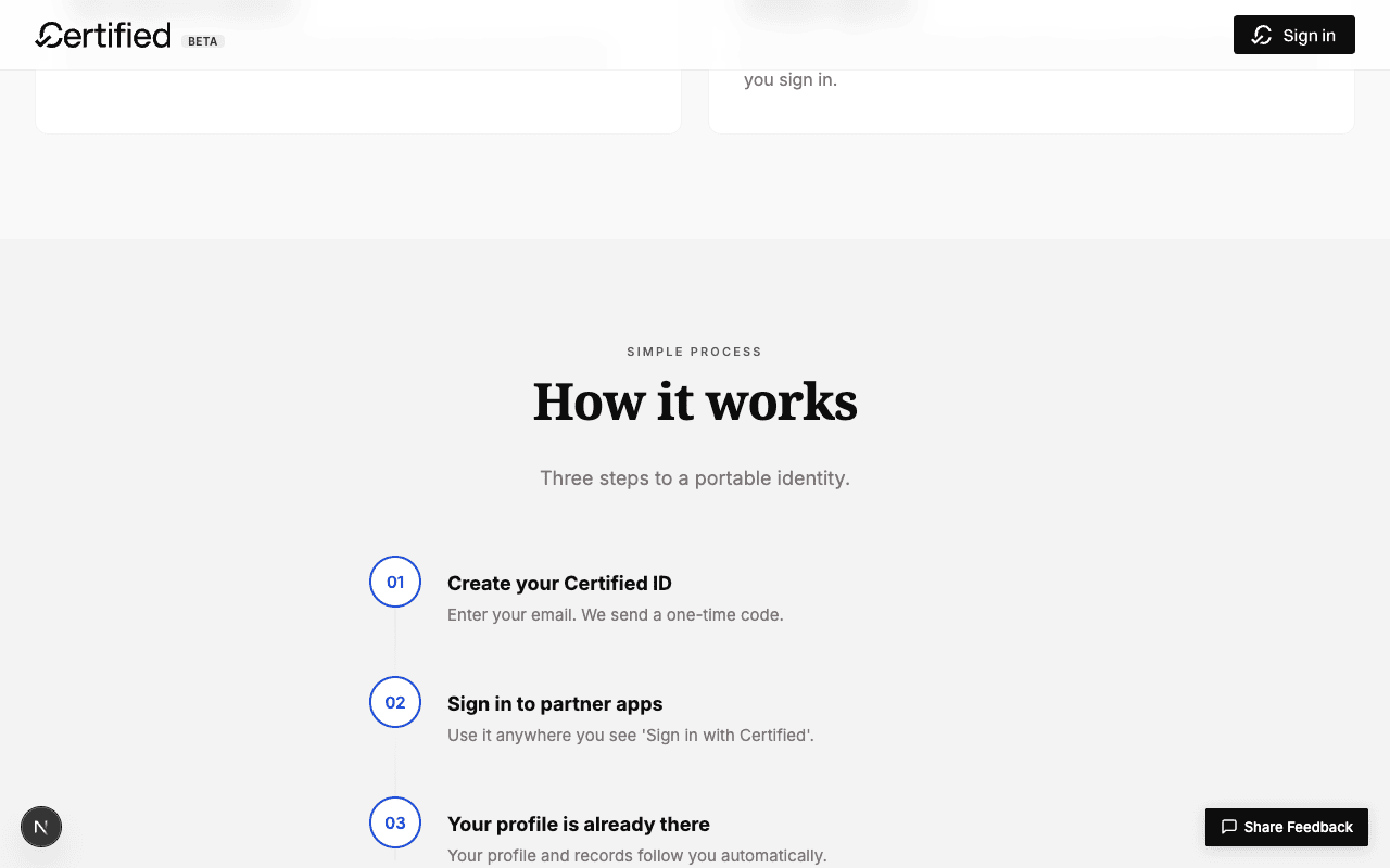
brand-tint → brand-soft → brand-tint gradient line connects them vertically. Hover fills the ring. The IA reads as a flow instead of a list.4. Partner apps — full-color logos in real cards
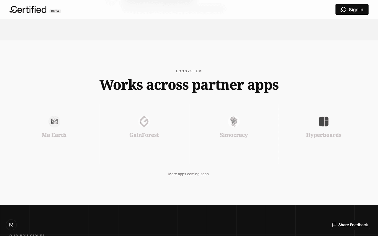
filter: grayscale(100%); opacity: 0.7 until you hovered, and the names rendered in --color-outline-variant — the section reads as placeholder content.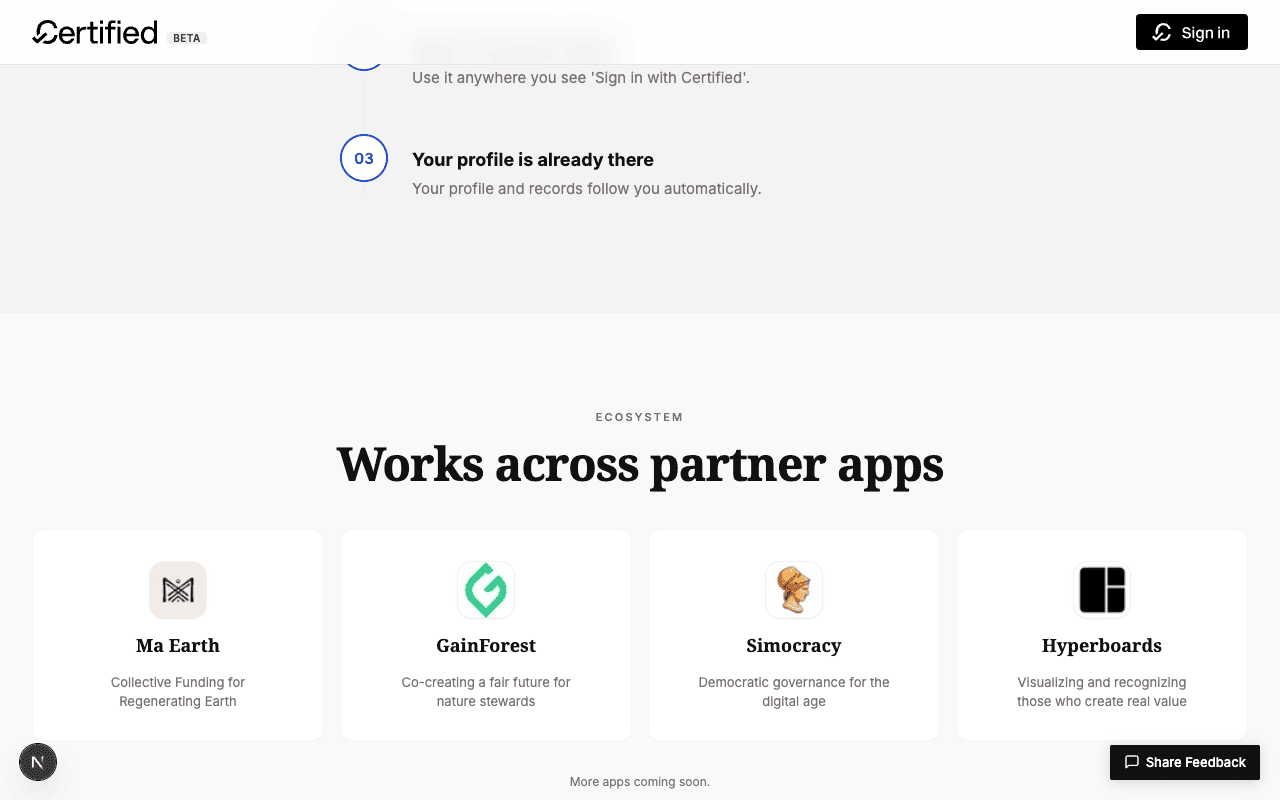
desc shows by default instead of being hover-gated. Now the section says "these are real partners shipping today".5. Closing CTA — brand-blue gradient moment
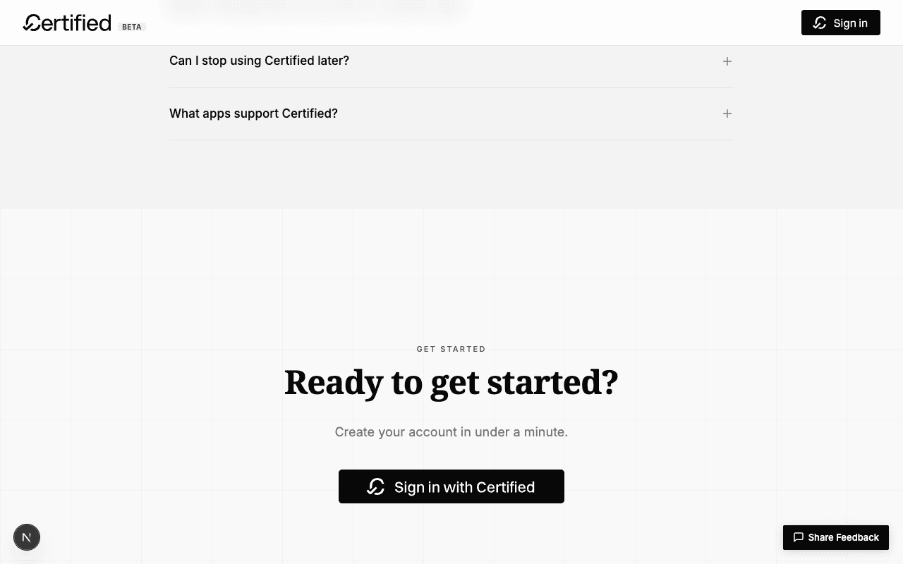
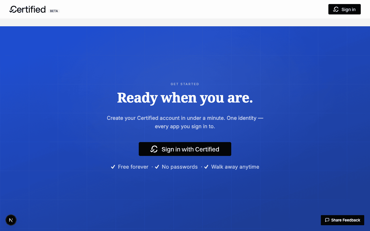
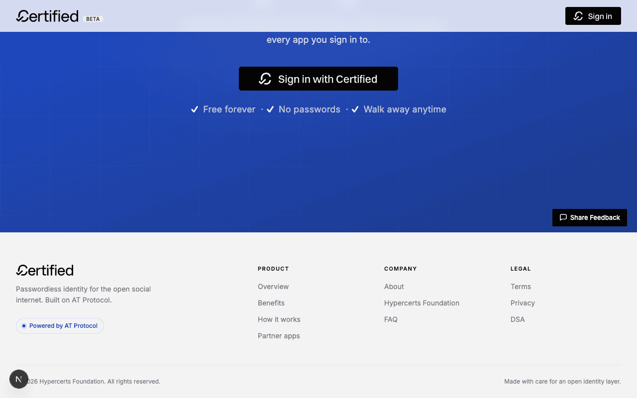
.landing-section--brand with a radial-into-linear blue gradient. New copy ("Ready when you are.") + a longer subtitle + the same trust microcopy as the hero, this time inside the brand surface for closing reinforcement.6. Footer — multi-column with protocol pill
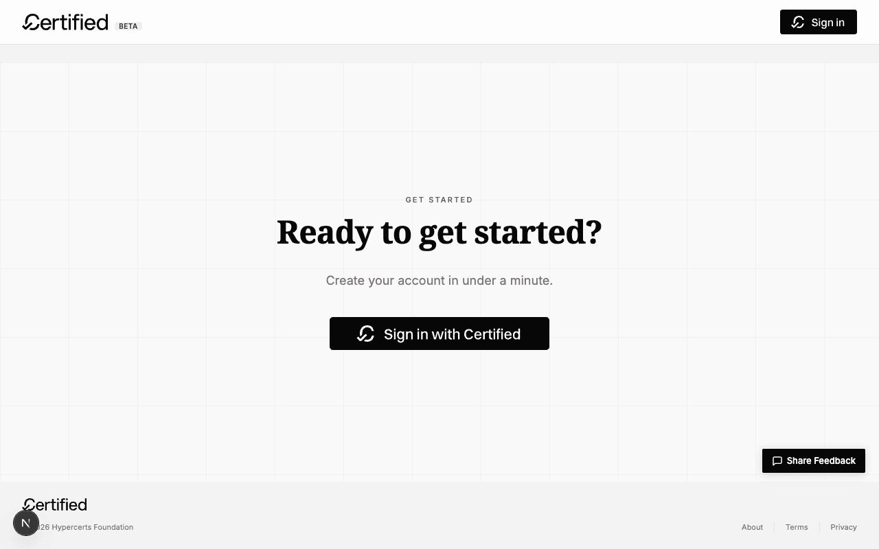
Mobile — everything still works at 390×844
What was actually changed (file-level)
Five files modified, no new dependencies, no API surface touched.
src/app/globals.css — added --color-brand, --color-brand-hover, --color-brand-soft, --color-brand-soft-hover, --color-brand-tint, --color-brand-text. Existing grayscale palette untouched.
Herolanding-page.tsx — bare .hero__label replaced by .hero__chip (anchor link), new .hero__glow behind the pattern, new .hero__trust list. Subtitle copy rewritten.
Bentowhat-you-get.tsx — first card switched to .landing-bento__card--brand variant; all four cards now use .landing-bento__icon-wrap tinted circles. Body copy rewritten.
How it worksglobals.css only — .landing-protocol__num upgraded from italic numeral to circled brand-blue ring; .landing-protocol__steps::before gradient connector added.
Partnersglobals.css only — removed filter: grayscale(100%), switched grid from 1px gap on container-high to 16px gap on white cards w/ rounded borders. .landing-network__desc always visible.
CTAready-cta-content.tsx + globals.css — section variant switched from --light to a new --brand with radial-into-linear gradient. Headline + body copy rewritten; trust microcopy added.
Footerfooter.tsx — single-row layout replaced by 2-column-grid (brand + nav) with three internal nav columns. New "Powered by AT Protocol" pill links to atproto.com.
The brand token ladder
--color-brand:           #1d4ed8;   /* primary brand surface */
--color-brand-hover:     #1e3fb8;   /* darker for hover */
--color-brand-soft:      #eef2ff;   /* page-background tint */
--color-brand-soft-hover:#e0e7ff;   /* hover variant */
--color-brand-tint:      #dbeafe;   /* badge / icon background */
--color-brand-text:      #1e40af;   /* darker text on soft bg */
Six tokens cover every brand surface in the redesign. Picked
deliberately to not collide with Bluesky's #0085FF:
we're more saturated and a notch darker, reading as authoritative /
notarial — consistent with Certified's positioning as an
identity product rather than a social one.
UI/UX audit of the redesigned site
After the redesign landed I drove the live localhost:3000
build via agent-browser — opening /welcome,
snapshotting the accessibility tree, exercising the sign-in modal
and the FAQ accordion, then checking /about as a sanity
check for a non-redesigned page. Findings below.
Accessibility tree — clean
agent-browser snapshot -i on /welcome
returns a healthy tree: H1 (hero) → H2
(section titles) → H3 (bento card titles) →
H4 (how-it-works step titles) → H5 (footer
column headings). Skip-nav link is present at e1. The
FAQ buttons advertise expanded=false when closed and
have region children with the same accessible name.
Footer is wrapped in <nav aria-label="Footer">.
Pass — semantic structure survives the redesign
Heading hierarchy stays linear (no skipped levels), every
interactive element keeps its accessible name, the new pill chip
is rendered as an actual <a> link to
#built-for-trust instead of a non-clickable styled
span.
Sign-in modal — one issue worth flagging
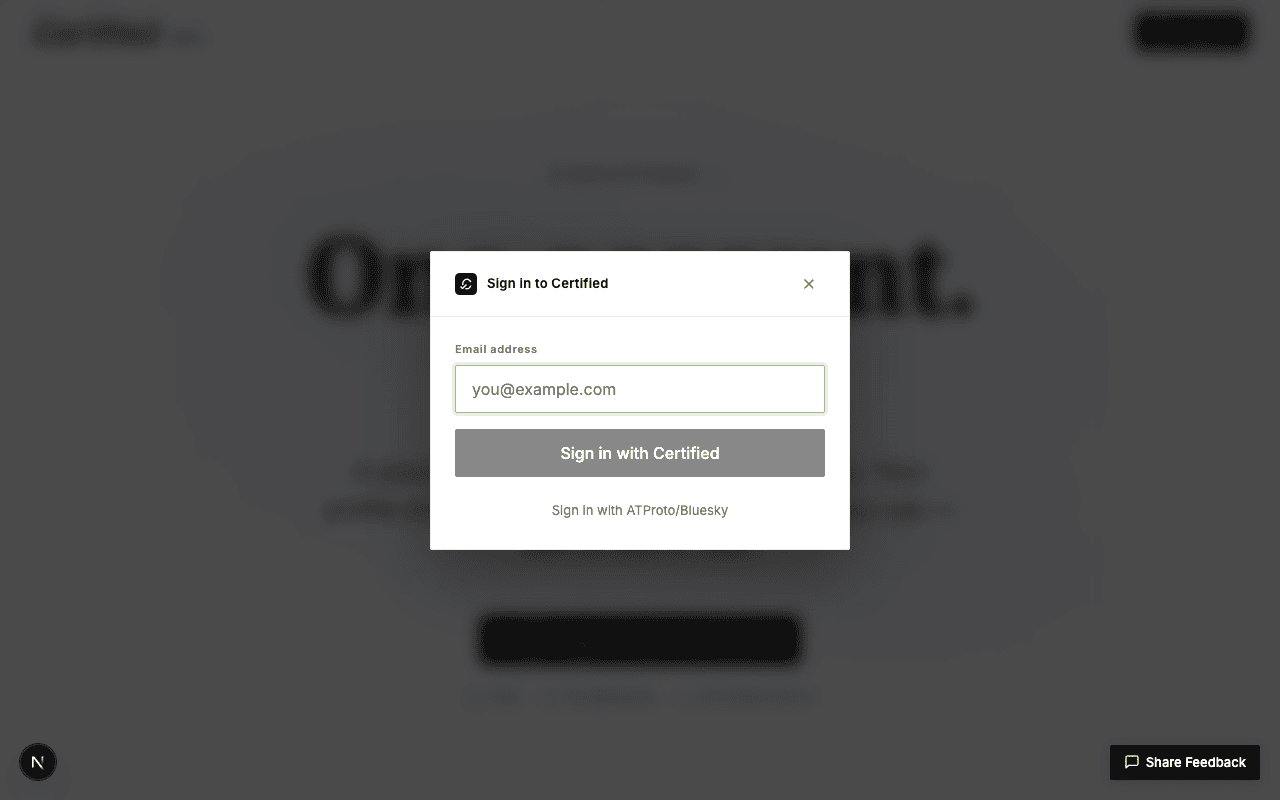
~40%. Two paths: "Sign in with Certified" (primary) and "Sign in with ATProto/Bluesky" (text link). Good — advanced users get an escape hatch without cluttering the primary path.Warn — primary CTA reads as disabled before validation
The "Sign in with Certified" button renders in ~50%
gray until the email field validates. There's no disabled
attribute (it's hover-able and clickable), but visually it looks
like a Material-style disabled button. A user trying to click
before typing will plausibly read "this button is broken". Two
fixes either work: (a) keep it visually enabled and rely
on aria-invalid + an inline validation message after
the click; or (b) add an aria-disabled="true" +
tooltip explaining what's needed. Don't do half-disabled-looking
styling without the semantic hint.
FAQ accordion — works, but the focus ring overlaps
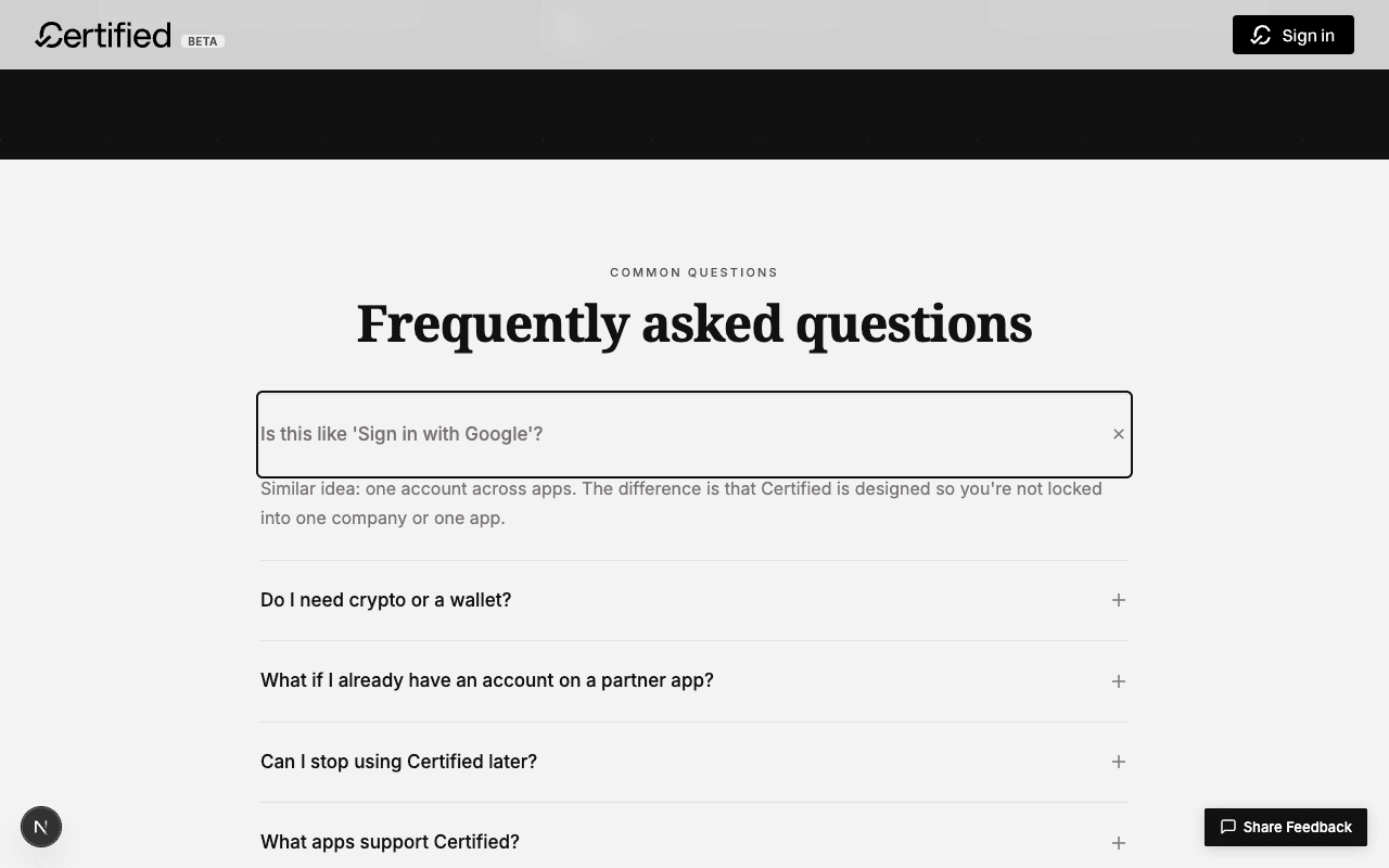
aria-expanded flips to true; the close icon rotates 45°. Animation respects prefers-reduced-motion.Warn — focus outline overlaps the open answer
The 2 px solid focus outline on the FAQ button extends
visually into the answer text below it (you can see the outline
passing through the first line of the answer in screenshot 11).
The overlap is just the answer's padding-top: 0
inheriting from the closed state — bumping the open answer's
top padding by 4 px, or moving the focus outline to a
:focus-visible with outline-offset: -2px,
resolves it.
Cross-page consistency — the redesign hasn't reached /about yet

/about renders body copy with a navy heading color (#0F2544 from tailwind.config.ts's navy token) and underlined links in the same hue. None of the new --color-brand tokens are wired in here.Warn — brand-blue is welcome-page-scoped right now
The redesign focused on /welcome because that's the
highest-leverage page (it's the only public-facing page that gets
serious traffic, and the only one indexed for SEO that isn't
legal/policy boilerplate). But /about,
/terms, /privacy, /dsa, and
the authenticated /settings shell still pull from the
Tailwind navy: "#0F2544" palette. They aren't broken
— they're just not on brand. Three options for the
follow-up: (1) replace navy in the tailwind config
with brand; (2) leave navy where it semantically means
"text on light background" and only swap accent colors; (3) gate
the brand color behind a feature flag and roll page-by-page.
Build + lint — clean
$ npm run build
✓ Compiled successfully in 3.2s
✓ Generating static pages using 11 workers (33/33) in 178.0ms

$ npx eslint <5 modified files>
✗ 1 problem (0 errors, 1 warning)
  — pre-existing <img> warning on the wordmark in footer.tsx
Pass — no new errors, no new warnings
The 9 lint errors and 18 warnings on the full repo all pre-date
this redesign (verified via git stash + re-run). My
five modified files contribute zero new errors and zero new
warnings beyond the pre-existing <img> vs next/image
one in the footer wordmark.
Findings summary
Pass — six sections redesigned, build clean, brand introduced
Hero, bento, how-it-works, partners, closing CTA, footer all shipped.
Six new --color-brand-* tokens. No new build errors,
no new lint errors, no new dependencies. Mobile (390×844)
verified at every section.
Warn — primary modal CTA reads as disabled before validation
Style or semantics: pick one. Don't ship half-disabled.
Warn — FAQ focus ring overlaps the open answer's first line
Cosmetic, but cheap to fix and worth doing before the redesign
gets pushed to main.
Warn — brand color is welcome-page-only
Five other public pages and the entire authenticated shell
still wear the old navy: "#0F2544" palette. Pick a
rollout strategy and follow up.
Reproducing
github.com/<hypercerts>/certified-app — this is a local-only redesign branch, not yet merged.
Branchworking tree on sharfy with 5 modified files (see "What was actually changed").
Buildnpm install && npm run dev at port 3000.
Audit driveragent-browser open http://localhost:3000/welcome, then snapshot -i for the a11y tree, click @ref for interaction, screenshot <path> for evidence.
Referencebsky.social/about — the Bluesky marketing site used as comparison anchor.
Skillhttps://pi-eval.vercel.app/skill.md — report deposit + styling contract.
Screenshotsassets/01-before-* through 12-after-* — before/after pairs at 1280×800 desktop, 390×844 mobile.