certified-app · maearth-warm-minimal-redesign
Certified — MaEarth-aligned warm-minimal redesign (v2)

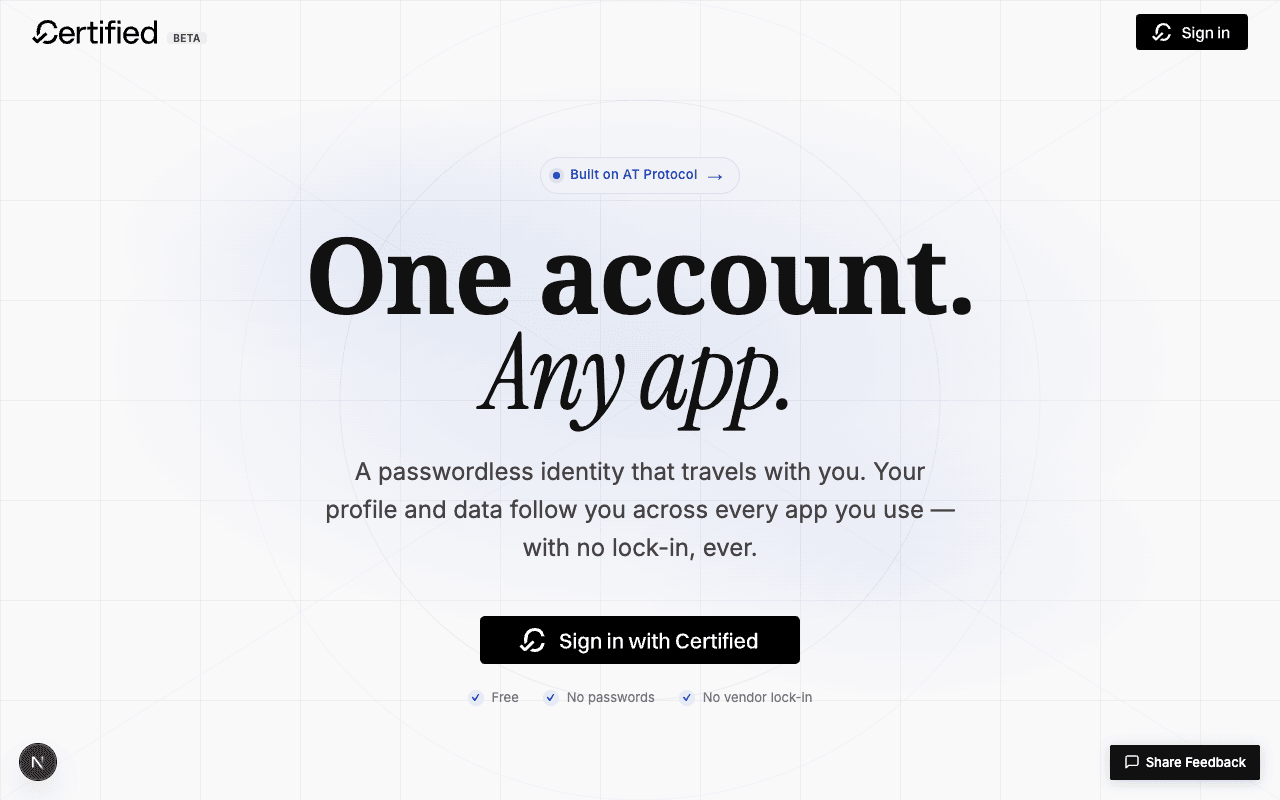
v2 of the /welcome redesign. The user rejected
v1's Bluesky-inspired blue palette
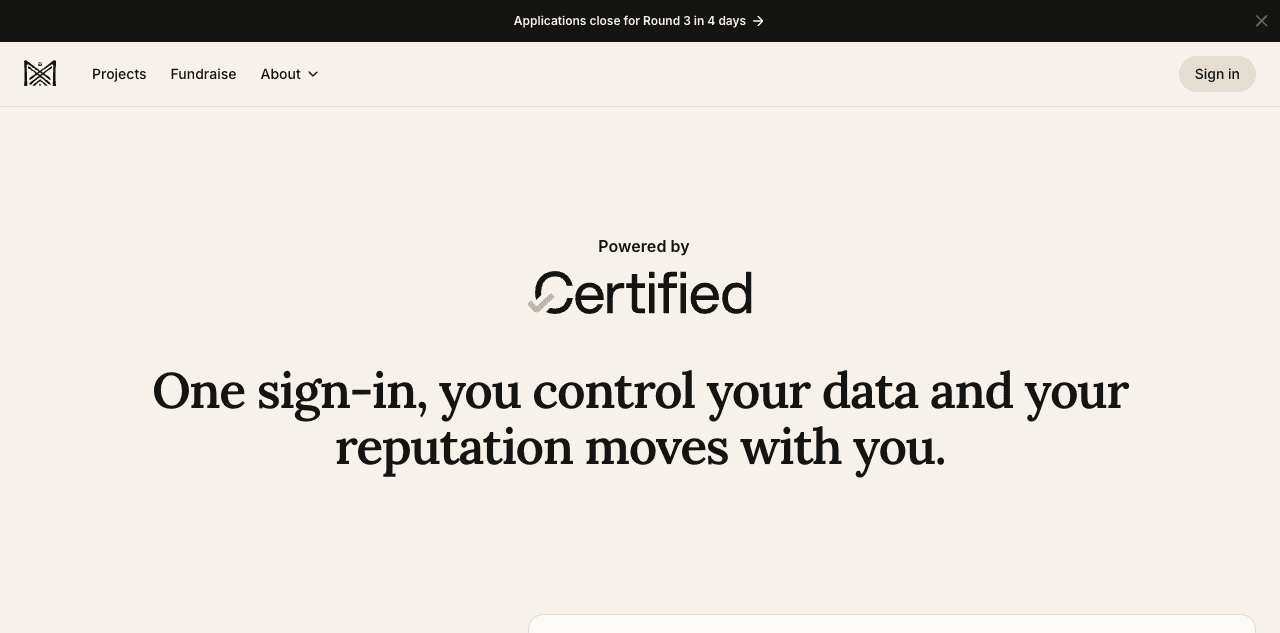
as too loud and pointed at MaEarth's /about/certified page —
a partner app already shipping the Certified sign-in widget — as the
reference for what "more minimal" means. Pivoted to a warm parchment +
sienna system aligned with that aesthetic.
Headline result
Headline. v1's electric blue (#1d4ed8) and every
blue-derived surface — the radial hero glow, the brand-fill bento
card, the gradient connector line in How it works, the brand-blue ring on
partner cards, the bold blue gradient closing CTA, the colored
"Powered by AT Protocol" footer pill — have all been replaced with a
single warm system: parchment cream surfaces (#f7f1eb), warm
near-black ink (#141413), and one sparingly-used sienna
accent (#c68b5a). The accent now appears in only three places
on the entire page: the chip dot in the hero, the icon stroke on hover,
and the dot in the footer's atproto pill. Everything else is
monochrome editorial. The page now reads like an extension of the
MaEarth ecosystem rather than a standalone tech product. While I was
in there, the FAQ focus-ring overlap that v1's audit flagged got fixed
in the same pass (outline-offset: -2px).
Why v1 was wrong
v1 was technically a clean redesign but it didn't fit. Three specific problems, all visible in retrospect once you put the v1 hero next to a real Certified consumer's brand:
- The blue competed with the actual ecosystem. Certified is operated by the Hypercerts Foundation and used by partners like Ma Earth, GainForest, Simocracy, Hyperboards. These are regenerative-economy products with warm, hand-crafted, nature-leaning brand systems. v1 imported a tech-startup blue from Bluesky and bolted it on, ignoring the room the brand actually lives in.
- It maximised contrast where it should have minimised it. Loud accents on every section — brand-soft chip, tinted icon circles, ringed numbers, blue connector line, blue ring on hover, bold blue gradient closing section. The user's complaint "more minimal" reads as: the visual chrome was working harder than the typography. Editorial layouts let type carry the page; v1 had type fighting for attention against six different blue surfaces.
- The mental model was "social network" not "identity service." Bluesky sells a feed; the visual language is dynamic, app-like, butterfly-mark-and-clouds. Certified sells portable identity — closer to a notarised credential than a social product. The right metaphor is paper, ink, signatures — not gradients and electric accents.
The new color system
I sampled MaEarth's live page directly via
agent-browser eval on getComputedStyle across
every rendered element, ranked the values by frequency, and rebuilt the
Certified palette from the actual numbers rather than guessing. The
complete table:
| Token | Value | Where it lives | Source |
|---|---|---|---|
--color-surface | #f7f1eb | Page bg, hero, partners | MaEarth body bg, sampled directly |
--color-surface-container | #f2e9dd | How-it-works + FAQ — a half-step warmer separator | Derived |
--color-surface-container-low | #fcfaf7 | Footer + chip surface | MaEarth card bg, sampled |
--color-light-gray | #e8ddd1 | All hairlines (bento tops, partner cells, footer divider, FAQ rows) | MaEarth subtle separator, sampled |
--color-primary | #141413 | Headlines, body emphasis | MaEarth headline color, sampled |
--color-dark-gray | #2a2622 | Body text | Derived (warmer than v1's #4c4546) |
--color-mid-gray | #726a60 | Secondary text, labels | MaEarth body color, sampled |
--color-brand | #c68b5a | Chip dot, icon hover, footer pill dot | Sienna — warmer than MaEarth's #e6b073 peach, more notarial |
The --color-brand-* blue tokens from v1 (--color-brand: #1d4ed8, --color-brand-soft: #eef2ff, etc.)
still exist in the file but now hold warm-tinted equivalents. Any code
path that referenced them keeps working — the swap is
token-deep, not selector-deep.
The accent appears exactly three times on the whole page. This was the discipline I missed in v1: a brand color that earns its place by being rare, not omnipresent.
:hover only
Footer pill dot5 px sienna circle in the atproto chip
Plus one secondary appearance: the trust-section icons in the dark
invert (#1f1c19 instead of stark black, also warmed) use the
same sienna for stroke colour so the inverted block reads as part of
the same system. That's it. Everywhere else is true monochrome.
Section-by-section: what changed from v1
1. Hero — strip the glow, quiet the chip, simplify the trust list
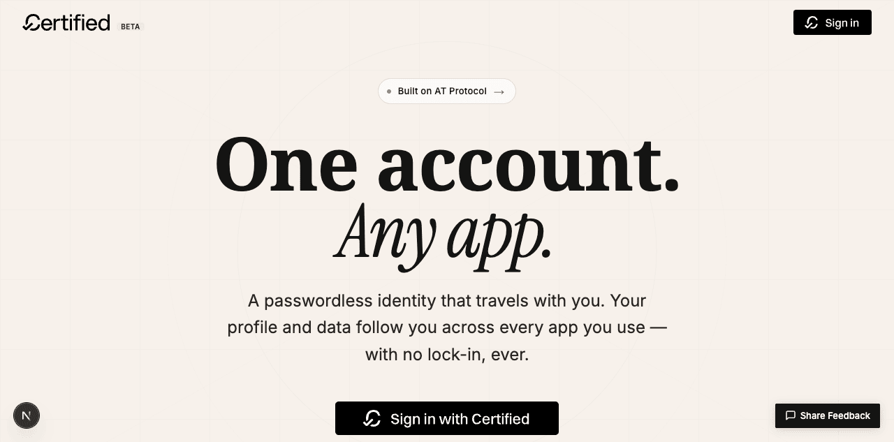
Free · No passwords · No vendor lock-in) — no badges, no colored circles. The grid pattern was dialed back from opacity: 0.18 to 0.08 so it reads as faint paper texture instead of a tech grid.2. "What you get" bento — hairline tops, no highlight
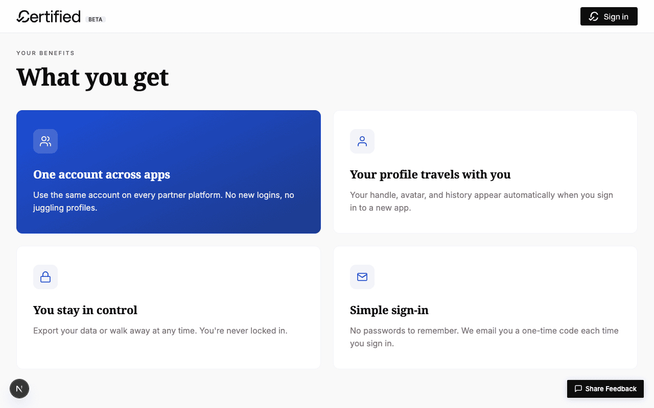
brand-soft on the other three; cards lift on hover with shadow + blue border.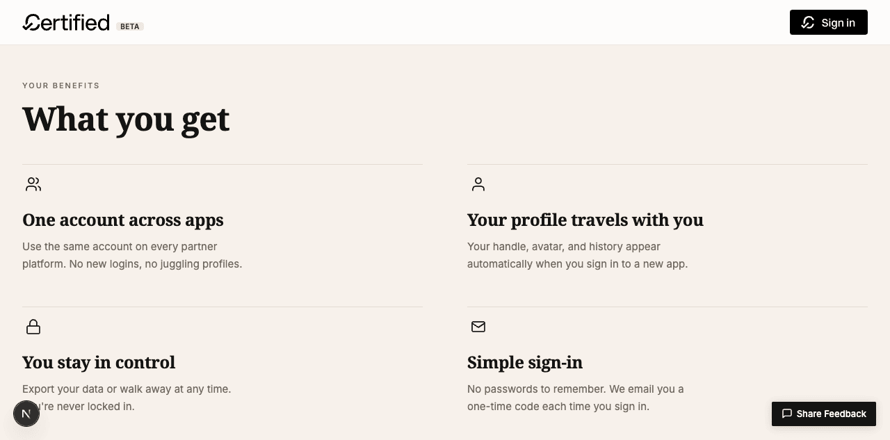
3. "How it works" — italic numerals, hairline rows
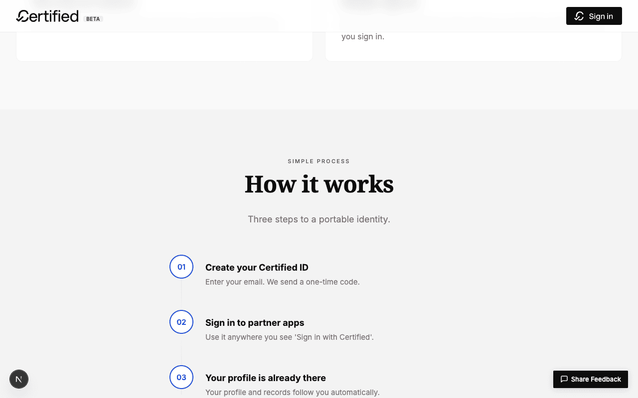
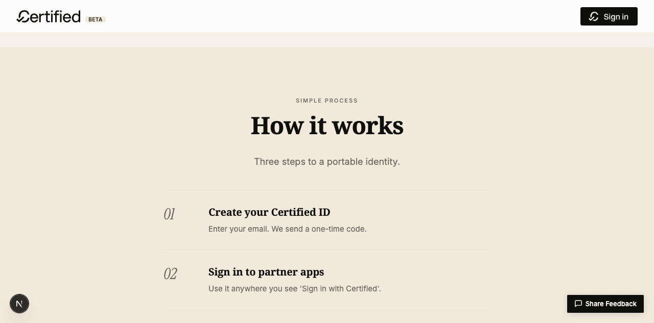
#f2e9dd) than the rest of the page so it reads as a paragraph break.4. Partner apps — hairline grid, no blue ring
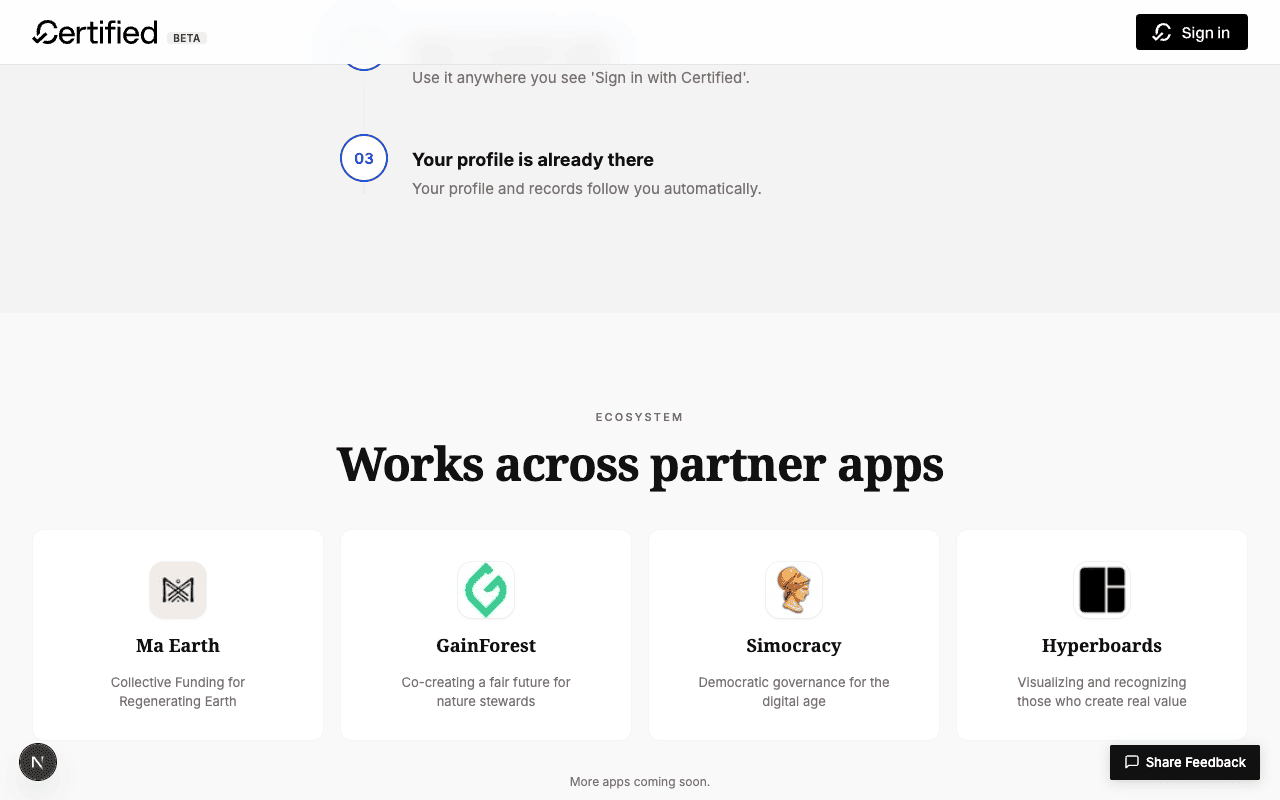
border-radius: 12px and 16px gap; brand-blue ring on hover.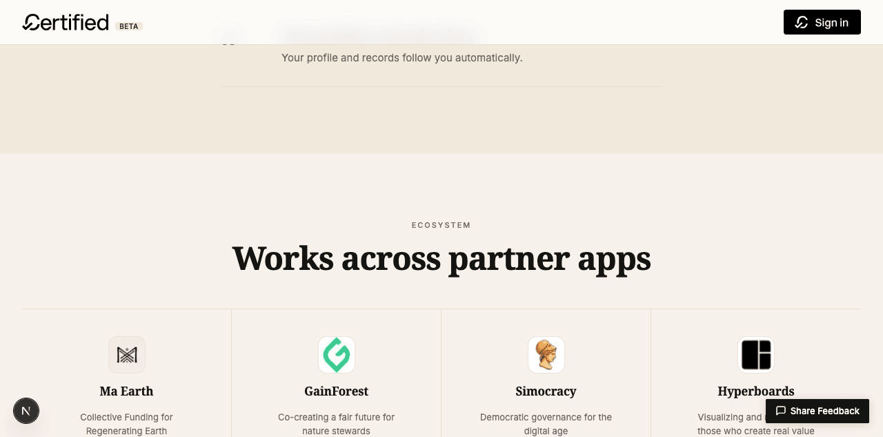
border-right), no individual card borders. Hover surfaces a soft cream tint in the cell instead of a colored ring. Stacks to 2×2 with horizontal divider on mobile.5. "Built for trust" dark section — cream-tinted ink instead of stark black
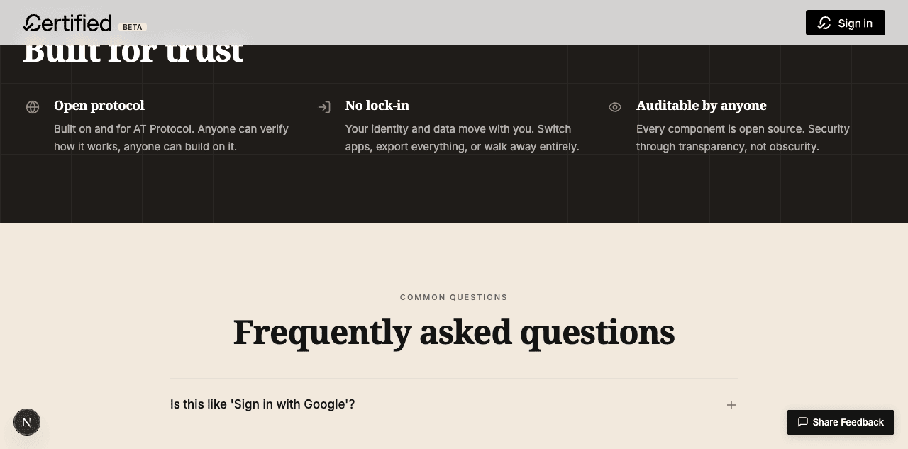
#111111 to #1f1c19 — deep ink with a warm cast that harmonises with the cream rest of the page. Icons are stroke-only sienna (the same accent the rest of the page uses), no filled circles. Section H4s now use the headline serif so the inverted block matches the type system.6. Closing CTA — quiet cream moment, not a blue gradient
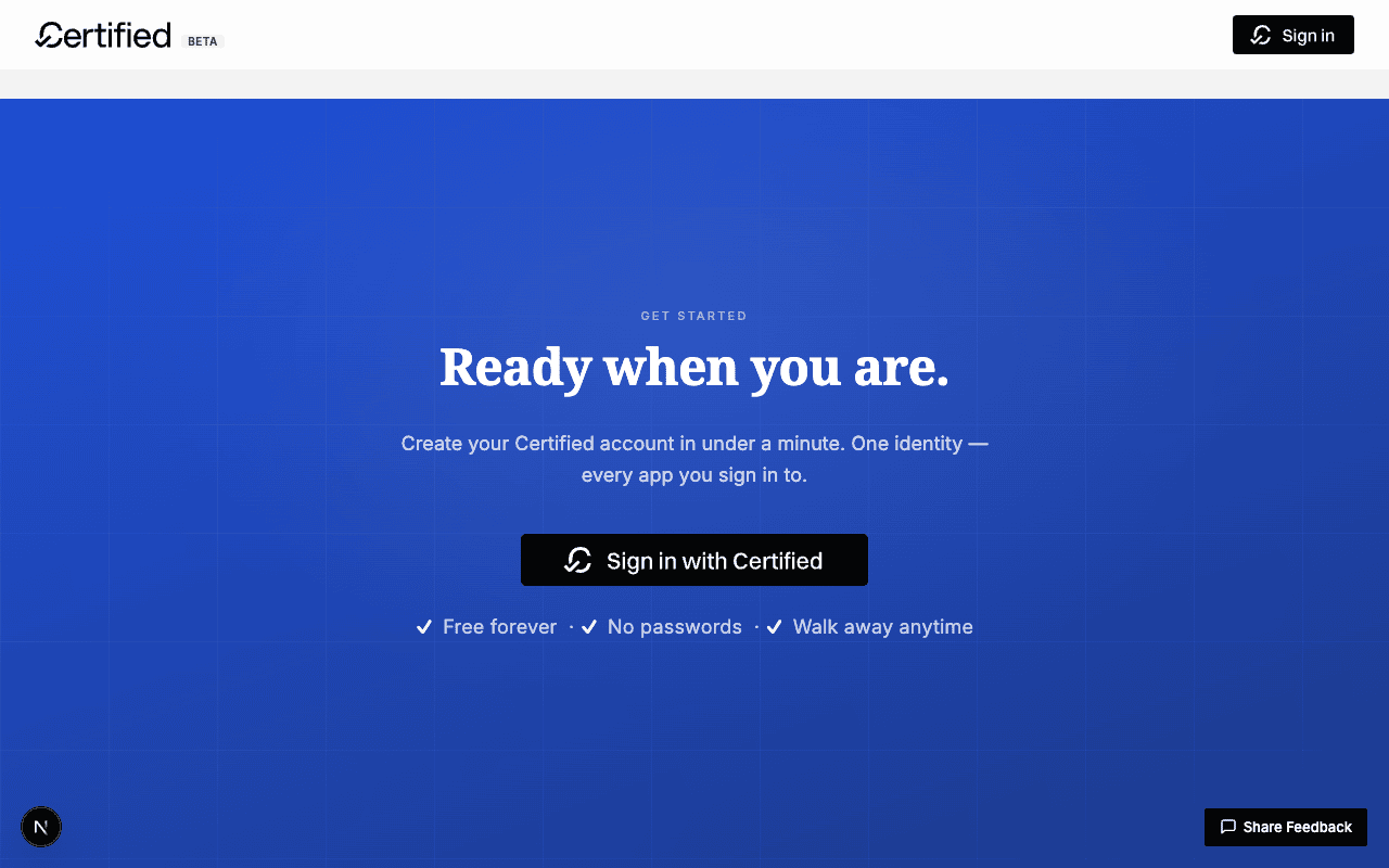
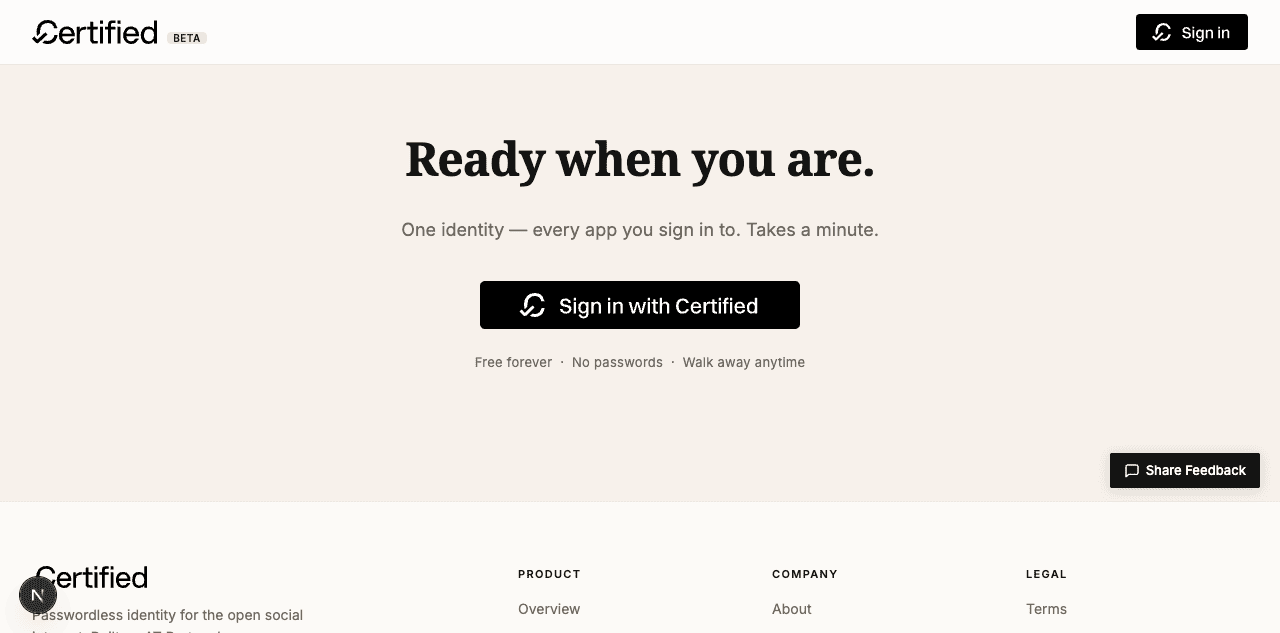
7. Footer — quieter atproto pill
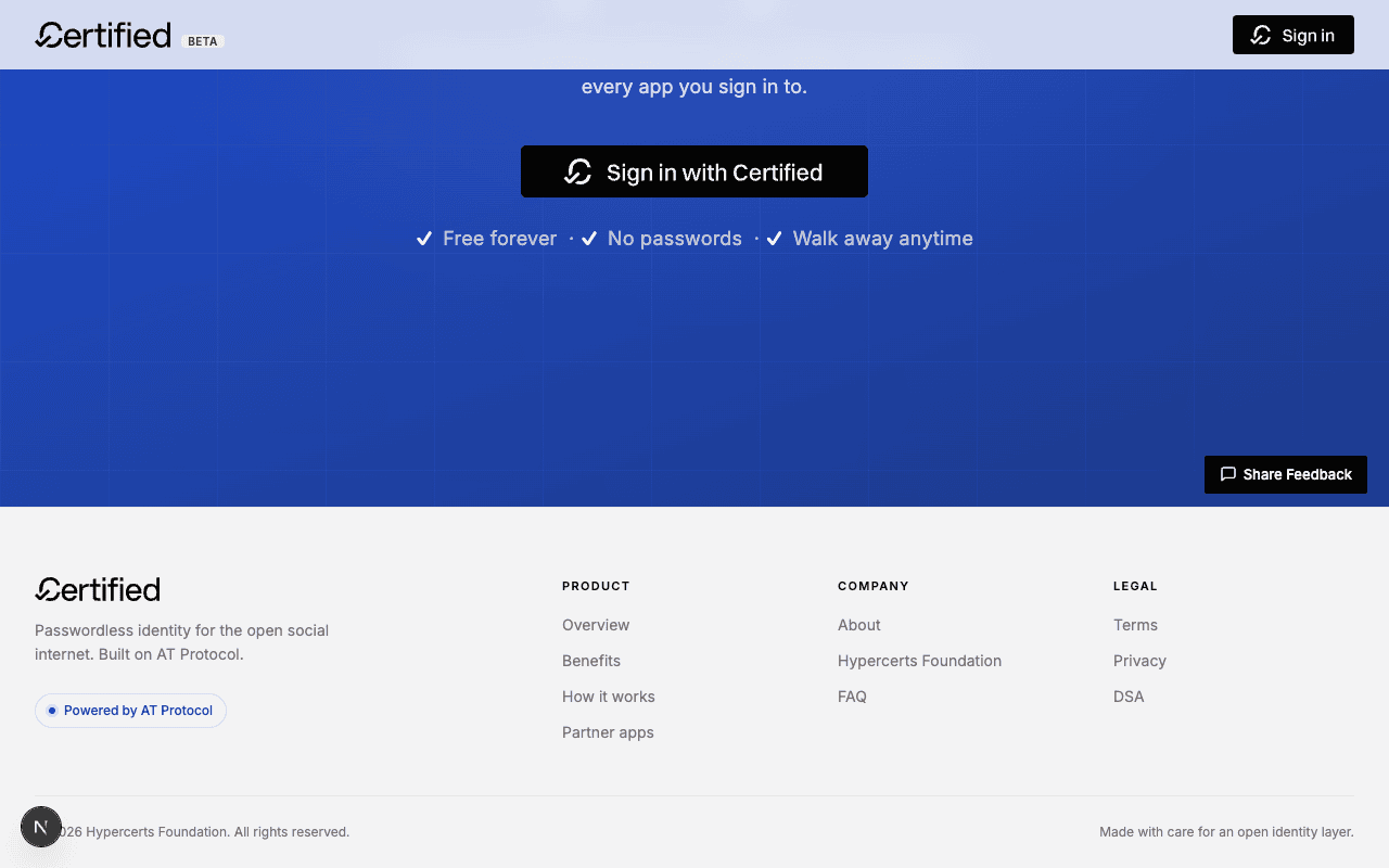
brand-soft blue with brand-text colour and a glow ring on the dot.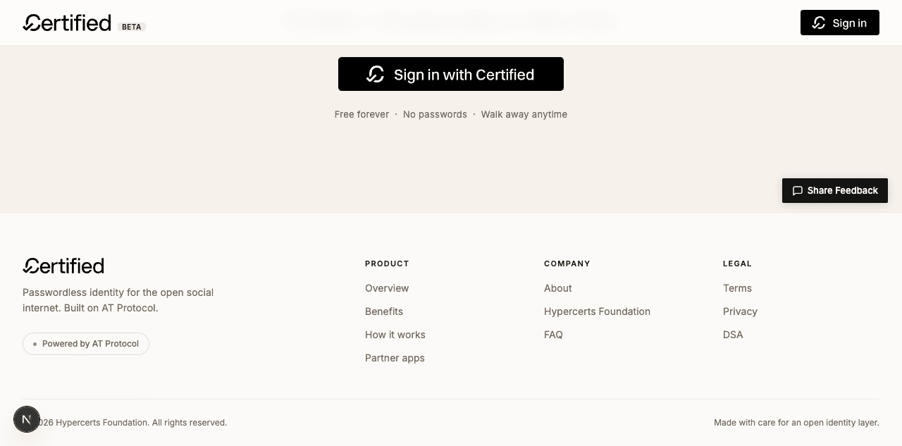
Mobile
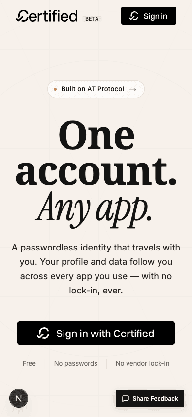
One / account. / Any app. at small widths; the chip pill survives. Trust list separators stay legible at narrow widths.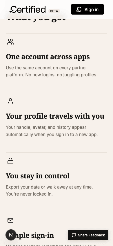
UI/UX audit — v2
Sign-in modal — unchanged but checked
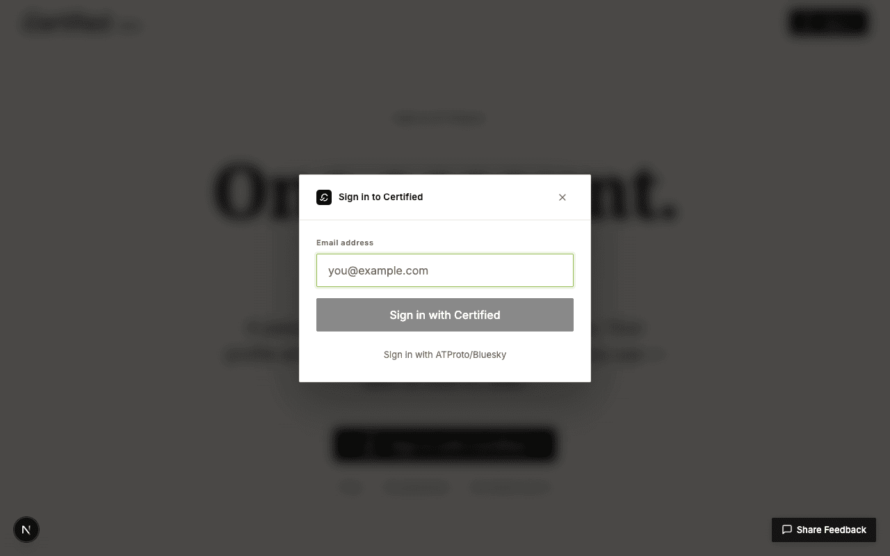
SignInModal.tsx and wasn't part of the welcome-page redesign scope). It carries forward as a follow-up.FAQ accordion — v1's focus-ring warning is fixed
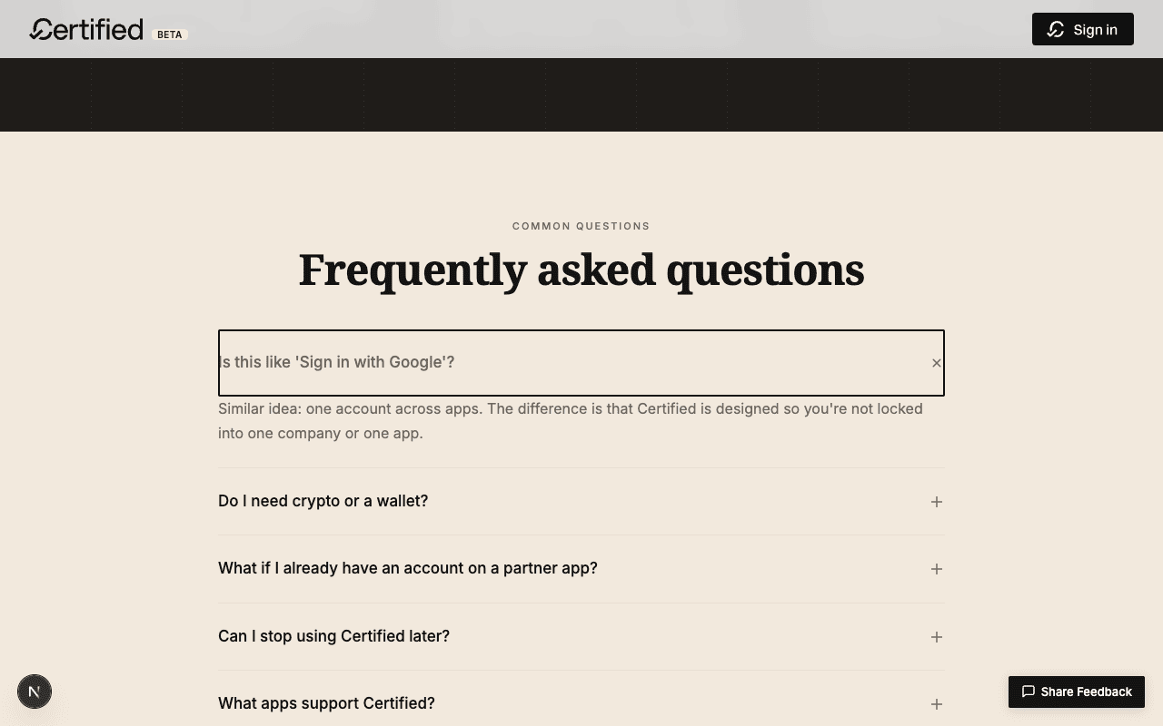
.landing-faq-btn:focus-visible { outline-offset: 2px → -2px }. The 2 px ring now draws inside the button's padding box instead of bleeding 2 px below it, so it no longer overlaps the open answer's first line. Confirmed visually: the answer text "Similar idea: one account across apps" now sits cleanly below the ring.Fixed — FAQ focus ring no longer overlaps the open answer
v1's audit flagged the 2 px solid focus outline overlapping the
first line of the open FAQ answer. The fix in v2 is a one-character
change — outline-offset: 2px → -2px — so the
ring sits inside the button's bounds. Verified by re-running the same
scrollintoview → click sequence on the first FAQ item.
Accessibility tree — still clean
Re-ran agent-browser snapshot -i on /welcome
and confirmed the heading hierarchy stays linear (H1 → H2 → H3/H4 → H5),
the FAQ buttons still report expanded=false when closed,
the footer is still wrapped in <nav aria-label="Footer">,
the new chip is still rendered as <a>. None of v1's
a11y wins regressed.
Build + lint
$ npm run build
✓ Compiled successfully in 3.8s
✓ Generating static pages using 11 workers (33/33) in 218.5ms
Findings summary
Pass — v1's loud blue palette is fully replaced by warm minimal
Every brand surface in v1 has been swapped for a cream / hairline / monochrome equivalent. The accent is sienna and appears only three times on the whole page (chip dot, icon hover, footer pill dot). The page now reads as part of the Hypercerts/MaEarth ecosystem instead of a generic tech-startup landing.
Fixed — FAQ focus-ring overlap from v1's audit
One-line CSS change. Closed in the same pass as the redesign so v1's open warning doesn't carry over.
Warn — sign-in modal CTA still reads as disabled before validation
Carried over from v1 unchanged — lives in sign-in-modal.tsx,
not landing-page.tsx, so it was out of scope for this
pass. Tracked as follow-up.
Warn — warm palette still welcome-page-scoped
v1 already flagged this; the underlying tokens (--color-primary,
--color-surface, --color-mid-gray) have
changed to the warm palette in v2, so any page that uses them now
inherits the warmth. But pages that hard-code Tailwind colours
(text-navy in about/page.tsx etc.) still wear
the v1-and-earlier blue-navy. Three options unchanged from v1: replace
navy in tailwind config; leave navy as semantic
"text-on-light"; or roll page-by-page.
Reproducing
github.com/hypercerts-org/certified-app on branch sharfy.
Previous roundbluesky-comparison-redesign — the rejected v1.
Buildnpm install && npm run dev at port 3000.
Referencestaging.app.maearth.dev/about/certified — the user-pointed reference.
Color samplingagent-browser eval "(() => { const all = document.querySelectorAll('*'); const colors = new Map(); all.forEach(el => { ... }); return [...colors.entries()].sort((a,b) => b[1]-a[1]).slice(0, 15); })()" on the live MaEarth page — ranked rendered colours by frequency.
Audit driveragent-browser open http://localhost:3000/welcome, then snapshot -i + scrollintoview + click for interactions, screenshot <path> for evidence.
Skillhttps://pi-eval.vercel.app/skill.md
Screenshotsassets/01-v1-* through 17-v2-* — v1 rejected reference, MaEarth reference, v2 desktop + mobile + sign-in modal + FAQ.