dorothea · news-modal-ux-review
FA2 dashboard — UX/UI audit

A walkthrough of the FA2 portfolio intelligence dashboard — main grid, field-mapping categories, team / entity reports, news modal, advice overlay — with concrete improvement recommendations across visual hierarchy, density, consistency, and a few outright bugs.
Headline
Headline. The dashboard is a remarkably dense piece of field intelligence with real editorial care — 1,144 news items, 876 wiki pages, 8 entity categories, 399 PL teams, 477 field-mapping entities. The recently redesigned news modal is the strongest single surface (clean source pills, day grouping, partial re-render, sticky controls). The areas with the most leverage for improvement are: (1) the main filter bar density on PL Teams, (2) visual inconsistency between “PL Teams” and “Field-Mapping” layouts, (3) a couple of direct-URL navigation bugs (Advice and team-report deep links don’t hydrate from a cold load), and (4) the active-state visual language in the news modal still uses three different colour treatments for what conceptually feels like one filter row.
What was reviewed
http://localhost:5173/ (dev) — commit 61938cb
Toolagent-browser · viewport-only screenshots @ 1280×600
SurfacesPL Teams grid · PL Teams table · Builders & Projects category · Team report overlay · Advice overlay · News modal (5 states)
Out of scopeMobile / narrow viewport · dark mode (not implemented) · wiki overlay · graph view (recently removed from nav)
1. PL Teams homepage
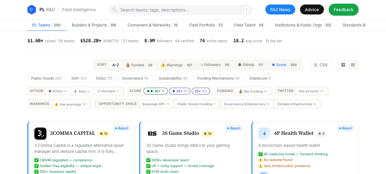
Headline metrics read as body text, not KPIs
The strip $1.6B+ raised · 59 teams | $528.2B+ AUM/TVL · 23 teams | 8.9M followers · 64 verified | 74 active repos | 18.2 avg score · 19 top tier
compresses six high-value figures into one line of small uppercase-grey text. These are arguably the single most important takeaways on the page (total deployed capital, total AUM, audience reach, ecosystem health). They deserve the same .stats > .stat > .big-number treatment used elsewhere in this report’s style guide.
Recommendation. Promote to a 4-tile or 6-tile KPI strip with large-format numbers (28-32px) and a one-word label, sitting directly below the category tab bar. The current strip is data-correct but visually deflating; first-time visitors miss the scale of what they’re looking at.
The filter bar carries 25+ controls in one block
Below the metrics strip, the filter region holds: 6 sort controls (A–Z, Funded, Warnings, Followers, GitHub, Score) + a CSV link + a grid/table toggle + 7 tag pills + 3 GitHub-activity pills + 3 score-tier pills + 2 funding/twitter toggles + 1 warnings toggle + 4 opportunity-space pills. Twenty-seven interactive elements before the first card row. The grouping labels (SORT, GITHUB, SCORE, FUNDING, TWITTER, WARNINGS, OPPORTUNITY SPACE) help, but the visual weight of every chip is identical. Cognitive load on first arrival is high.
Recommendation (low effort). Collapse anything beyond Sort + the 7 FA2-tag pills behind a single + Filters (5) chip that opens a popover or expands inline. Show active-filter count next to the chip. Keep the most-used filters (sort + tag) always visible.
Recommendation (higher effort). Inspect dashboard analytics: which filters are actually used? Suspect Sort and tag pills account for >90% of clicks; the rest could become an opt-in “advanced” tray.
Category tab bar is clipped at the right edge
At 1280 px the rightmost tab (Standards Bo…
) is visibly truncated, and Research & Academic Labs 30
is offscreen entirely. There’s no scroll affordance and no overflow indicator, so on this width users with no other prompt may not realise three categories exist past the visible edge. Vertical scrolling cannot reach them either.
Recommendation. Either (a) tighten the per-tab horizontal padding so 9 tabs fit at 1280 px, (b) collapse low-volume categories into a More ▾
dropdown, or (c) add a fade gradient + arrow affordance so the bar is clearly horizontally scrollable.
Top-right CTAs use 3 different button shapes for 3 actions
FA2 News (blue solid pill), Advice (black solid pill), Feedback (green solid pill) sit side-by-side but use different palette colours and the third is an <a> while the first two are <button>. The visual hierarchy implies these have different importance levels, but they’re really three peer surfaces. The colour palette also doesn’t reuse anywhere else in the page (the brand blue is for primary tabs and source links; black is for body text; green is otherwise unused).
Recommendation. Use one neutral chrome (e.g. light-grey background, dark text) for all three, with a single primary CTA visually differentiated only if you have an actual hierarchy you want to enforce (likely Feedback = primary blue, News + Advice = secondary).
Card grid is genuinely good
The team cards have strong information density done right: logo + name + score + report-status badge in the header; tags inline; pros / warnings as bulletted micro-content. The card border-left accents and the “Has Report” badge create real scannability. Don’t change this.
2. PL Teams — table view
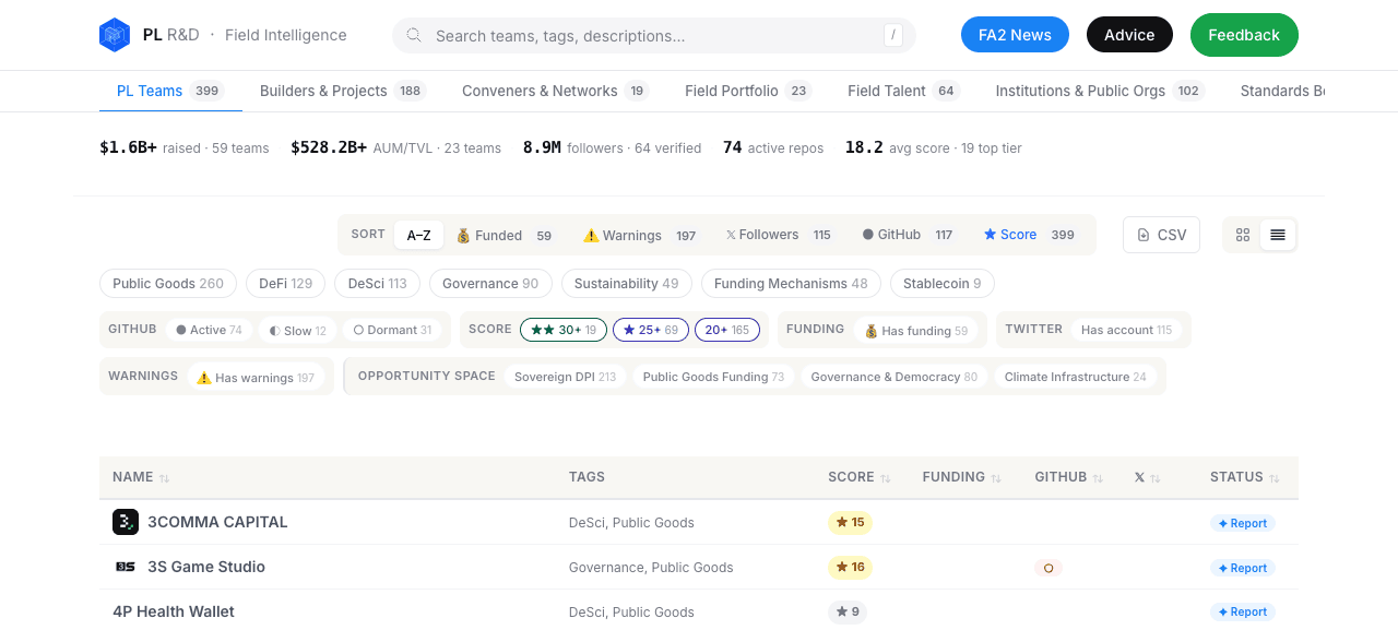
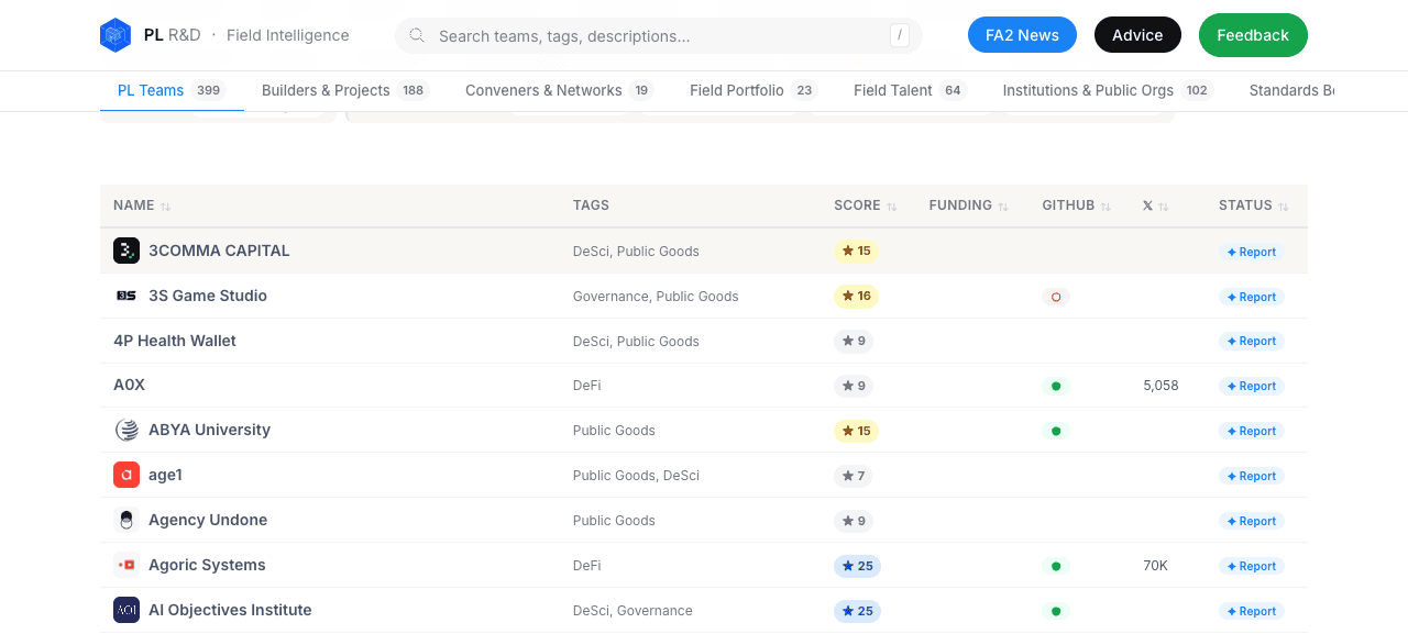
Filter bar should auto-collapse in table view
Table view exists for users who want data density. Yet the same chunky filter bar sits above, eating ~340 px of vertical space before any table row is visible. On 600px-tall viewports (laptops, half-screen browsers) zero data rows appear above the fold.
Recommendation. When viewMode === 'table', collapse the filter bar by default behind a + Filters chip. Keep Sort visible (the table headers handle sort anyway, so it could be hidden too). Even shaving 200 px brings 4 rows above the fold.
3. Builders & Projects (field-mapping category)
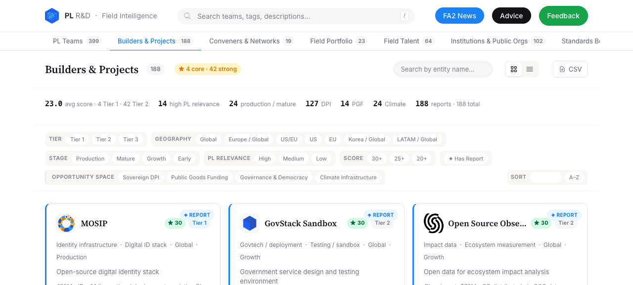
PL Teams and field-mapping pages look like two different products
This page (Builders & Projects
) uses a serif H1, inline labels on the filter bar (TIER / GEOGRAPHY / etc.) at the leftmost position of each row, and a different stats treatment (23.0 avg score · 4 Tier 1 · 42 Tier 2 | 14 high PL relevance | 24 production / mature…
). PL Teams uses a sans H2-ish heading, uppercase grouping labels above chip rows, and the inline-text stat strip flagged in §1.
Both layouts have merit. They are not consistent with each other. A user toggling between PL Teams and Builders feels like they’re crossing a layout boundary, not switching a filter.
Recommendation. Pick one filter-bar pattern and apply to both. The inline-label-per-row pattern (used here) is denser and more legible than the uppercase-label-above-row pattern (used in PL Teams), and it scales better as filter groups grow. Migrate PL Teams to match.
Headline stat strip is much better here
The Builders page’s 23.0 avg score · 4 Tier 1 · 42 Tier 2
strip uses bold numbers + grey labels in proper proportion. It’s the same idea as the PL Teams strip but visually weighted correctly. Use this treatment everywhere.
4. Team report overlay
Strong information layout
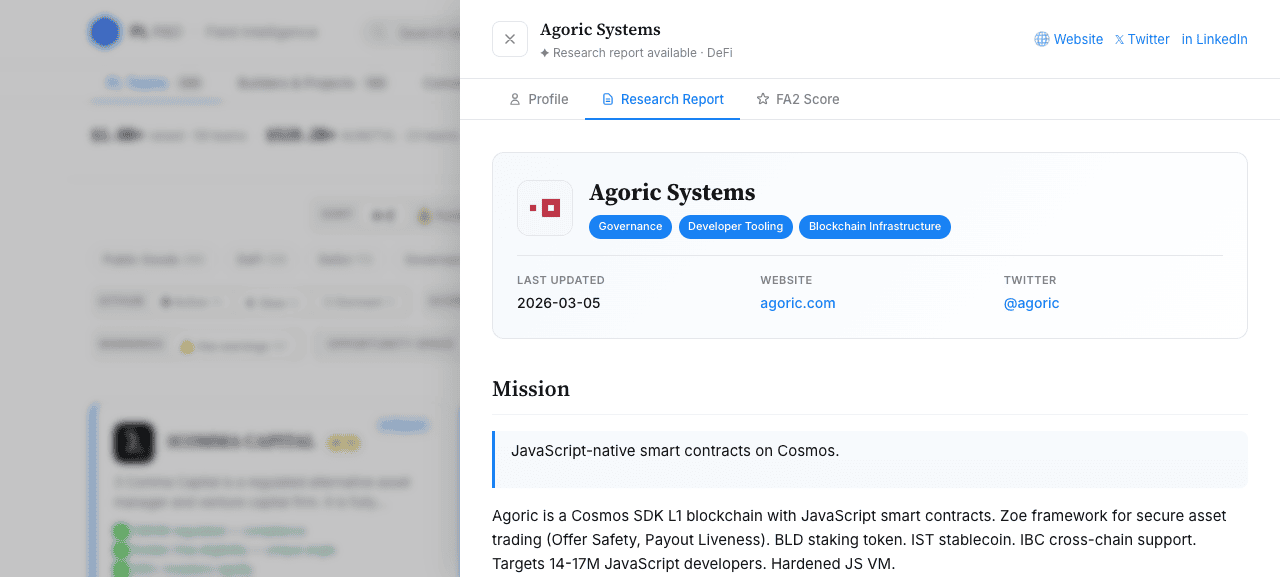
The three-tab pattern (Profile / Research Report / FA2 Score) is a clean separation of concerns: structured data, narrative, scoring. The mission callout block above the body text is also well-styled. The serif H1 + tag pills + LAST UPDATED / WEBSITE / TWITTER tri-column key-value strip make the entity instantly scannable.
Last updated 2026-03-05
is ambiguous
Does this mean the team last updated their PL Directory profile, the research report was last edited, or this dashboard’s data file was rebuilt? All three are plausible interpretations and they answer different reader questions.
Recommendation. Disambiguate the label: Profile updated
/ Report written
/ Last activity
. If multiple of these exist, surface them all in the key-value strip.
5. News modal
The news modal was the focus of the recent UX pass. Most of the previously-noted issues (sort by month-bucket beating same-day items, no source-domain visibility, modal flicker on every filter click) are fixed. The findings below are second-order polish.
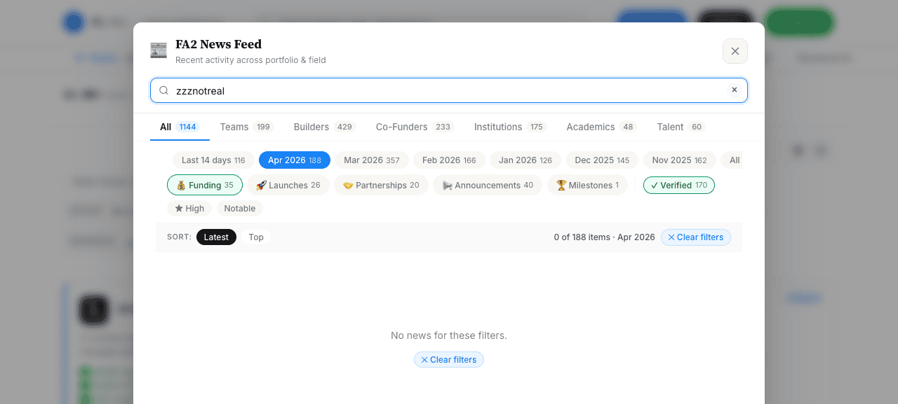
Three different active-state colours for one filter row
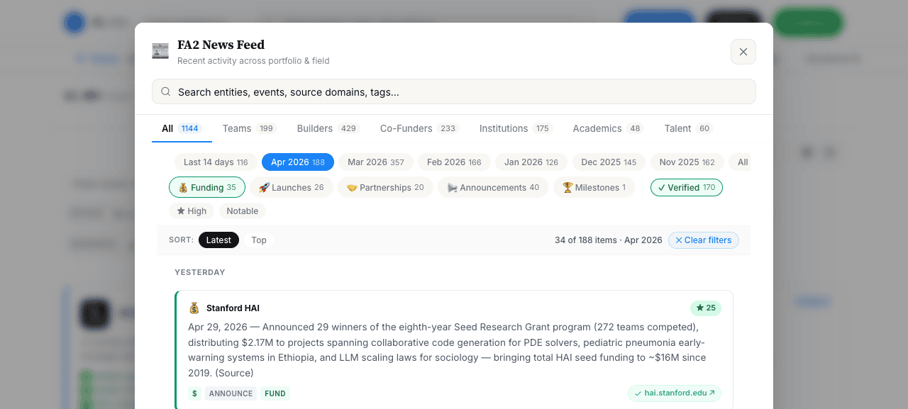
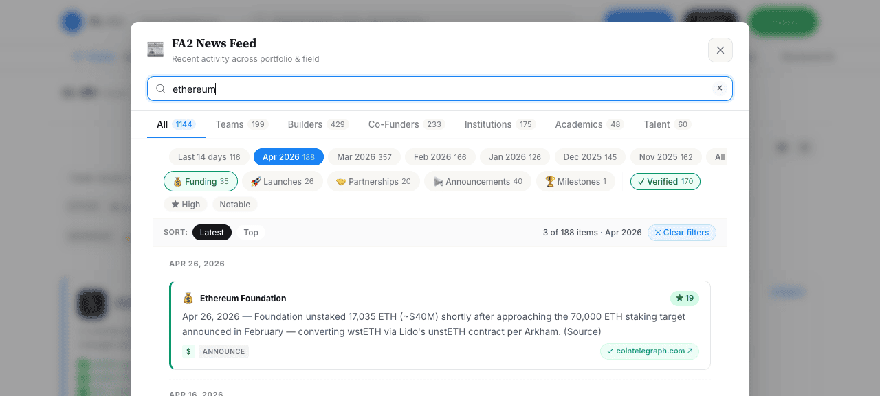
In the multi-filter screenshot the active Apr 2026 pill is solid blue, the active Funding pill is a green outline with green icon background, and the active Verified pill is green outline. The user toggles them all the same way (click a pill, count updates) but the “active” affordance shouts three different things.
Recommendation. Pick one active treatment for the whole filter region. Suggest: filled tinted background, no border, accent-coloured ink. The filter-type can be hinted via the static icon/dot to the left of the label, not via the active-state colour. Keeps the active state predictable across rows.
Date-pill row wraps to two lines, isolating “All time”
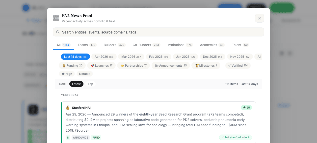
At 880 px panel width, the time-range row holds 8 pills (Last 14 days, Apr 2026, Mar 2026, Feb 2026, Jan 2026, Dec 2025, Nov 2025, All time). The first 7 fit on line one; All time
wraps alone to line two on its own. Hand-of-mouse symmetry breaks; the row also competes vertically with the second filter row below.
Recommendation. Either (a) tighten per-pill padding by ~2 px so 8 fit, (b) drop oldest months automatically (Nov 2025 has 162 items but is 6 months stale — collapse anything > 6 months into Older ▾
), or (c) move All time
to be the rightmost option after a divider, with the implication that it’s an escape hatch.
Score and Type pills mix two different mental models
The second filter row stitches together type pills (Funding / Launches / Partnerships / …) + a Verified toggle + significance pills (★ High / Notable). These are conceptually different filters — type is a single-select tag, Verified is a boolean, significance is a numeric threshold — but they share a row and styling. New users have to learn that ★ High
means ≥15 score, not has the High tag
.
Recommendation. Either group them with an explicit divider + caption (TYPE — pills — QUALITY — verified+score), or move significance into the Sort row as a sort modifier (Latest · Top · High-only
). Reduces the second row to: type pills + verified, which is more uniform.
Source-domain pills are a strong improvement
Showing hai.stanford.edu ↗ instead of generic Source ↗ turns the per-card affordance into an instant credibility signal. Primary sources (organisation domains: circle.com, blog.ethereum.org, worldbank.org) are visually obvious vs aggregators (cointelegraph.com, tradingview.com). Keep this.
Day-grouped feed in ‘Latest’ sort is excellent
Inserting TODAY / YESTERDAY / APR 26, 2026 headers at day boundaries gives the feed a visible cadence. Combined with the partial re-render that preserves modal scroll position, scrolling and filtering both feel anchored. The same pattern would help on the wiki overlay if it were brought back.
6. Bugs found
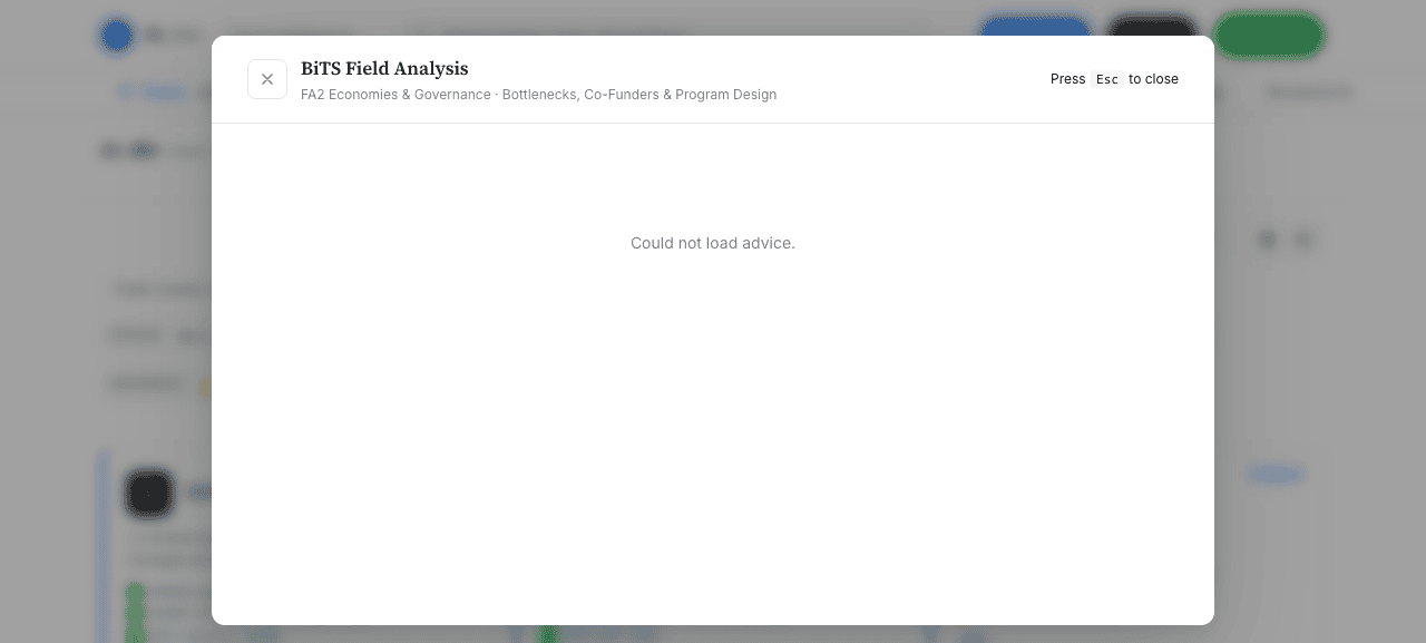
/#/advice shows “Could not load advice”. The same overlay loads correctly when triggered from the Advice button.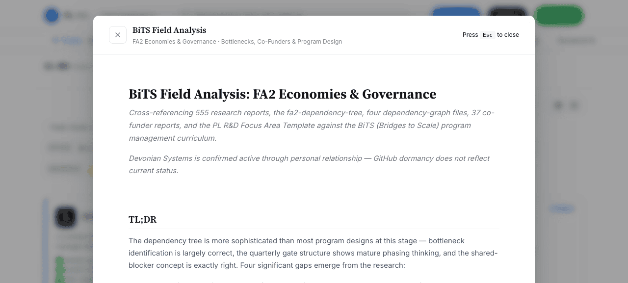
Direct hash routes don’t hydrate overlay content
Reproducible: load http://localhost:5173/#/advice from a cold tab → modal opens but body shows Could not load advice.
Click the Advice button instead → same modal, content loads. curl /advice.md returns 200 with the markdown. So the file is reachable; the route’s init logic doesn’t fire loadAdvice() on cold-load.
I observed the same shape with /#/news in one trial (Could not load news.
on cold load) though I couldn’t reproduce it consistently. /#/team/<slug> deep links open the overlay correctly when the parent dashboard finishes loading; if hash parsing happens before data is hydrated, the overlay can render before state.newsData is populated.
Hypothesis. parseHash() sets showAdvice = true / showNews = true in parseHash, but the corresponding loadAdvice() / loadNews() calls are wired only to the click handlers, not to a post-hydrate effect. So a deep link sets the flag without ever fetching the asset.
Fix. After the initial render() in main.js init, dispatch the right loader based on state:
// at end of init(), after the first render()
if (state.showAdvice) loadAdvice()
if (state.showNews)   loadNews()
Card click on ?cat=<category> pages doesn’t open the report overlay reliably
Clicking the MOSIP card on the Builders & Projects page (matched by AX ref to the card’s generic wrapper) didn’t open the report overlay in repeated trials. The same click pattern does work on the PL Teams home grid. Both routes use the same overlay machinery (renderFmReportOverlay) so this is most likely a missing event-delegation match in the field-mapping click handler — or the click target is a child element that .closest('[data-fm-slug]') doesn’t resolve to.
Recommendation. Verify data-fm-slug is set on the outer card element, not just on the inner avatar. Spot-check the click handler in main.js for the fm card click” case.
7. Cross-cutting recommendations
Two-bar header competes with itself. The page top has (1) brand + global search + 3 CTAs, then (2) category tab bar — both stacked, both around 56 px tall. That’s 112 px before any content. Consider merging: brand on left, category tabs in the middle band, CTAs + search collapse to icons on the right above ~1280 px. Or float the global search into the page body, since it’s scoped to PL Teams anyway.
One filter-bar pattern. Today there are at least three: PL Teams (uppercase labels above chip rows), field-mapping (inline labels left of each row), news modal (no labels, just rows of pills). Pick one. The field-mapping pattern is the densest and reads best.
Active-state visual language. News modal already has three; the rest of the dashboard uses solid-blue across the board. Standardise on one active treatment: filled tinted background, no border, accent-coloured ink. Filter type can be encoded via icon on the left, not via active colour.
Keep. The card grid (PL Teams), the source-domain pills (news), the day-grouping headers (news), the BiTS field analysis content layout, the partial re-render in the news modal. These are the strongest existing patterns and should set the tone for the rest of the dashboard.
Reproducing
cd dashboard && npm run dev (vite, port 5173)
Toolagent-browser open http://localhost:5173/
Captureagent-browser screenshot (viewport, ~600px tall)
Surfaces visited/#/ · /?cat=builders · /?view=table · /#/team/agoric-systems · /#/news · /#/advice
Screenshotsassets/01-*.png through assets/11-*.png (12 captures total)
Build commit audited61938cb (post news-modal partial re-render fix)