gainforest-app · mobile-responsive-pass
Mobile responsive pass on the GainForest landing

Hardened the landing for phones — kept the live Bumicerts and Globe windows visible (no hiding), shrank the typography, mounted a mobile nav drawer, and re-anchored the floating capybara — while leaving the desktop draggable-windows layout untouched.
Headline result
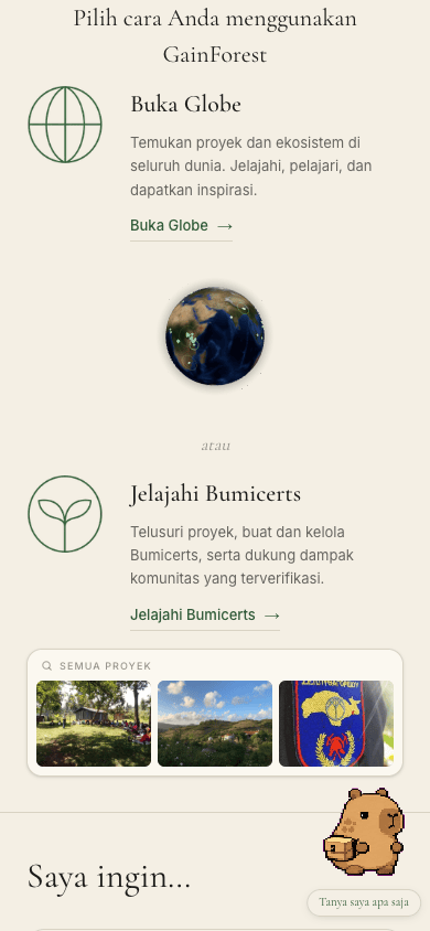
Headline. At 390 × 844 (iPhone 13/14/15) the landing now reads beautifully end-to-end: hero fits, both Bumicerts and Globe windows render full-width inline beneath the hero copy (instead of overflowing or hiding off-screen), a slide-in nav drawer covers the 5 hidden links, and the floating Capybara flips to bottom-right so it doesn't sit on top of the single-column content stream. Desktop (≥ lg, 1024 px) keeps the original draggable-windows layout.
Before / after
Same viewport (iPhone 14 size, 390 × 844), same scroll position. The before-shots show why the page needed a pass: 78 px hero headline doesn't fit, the 400 px Bumicerts card overflows the right edge, and the 280 px Globe card is pushed entirely off-screen by its right:-35px desktop offset.
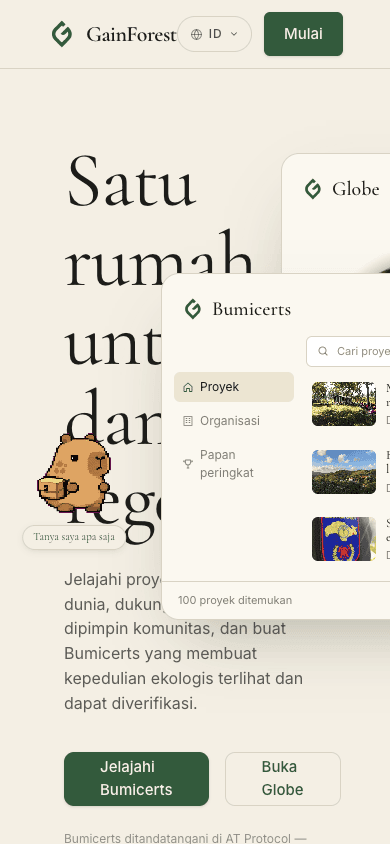
right:-35px, pushed past the viewport edge). Capybara sits on the headline.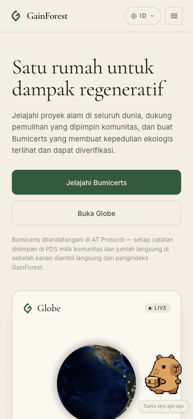
Live data, inline (where it used to be hidden)
The two windows aren't shrunk into a placeholder — they're the same live data the desktop floating windows show, just rendered inline (no position: absolute, no drag) at max-width: 420px. The Bumicerts card retains its full rail (Proyek / Organisasi / Papan peringkat), the live search bar, three live project rows pulled from the indexer, and the footer count.
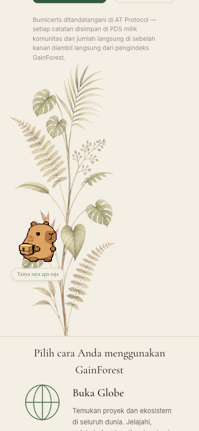
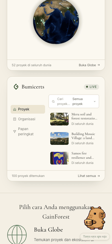
Walkthrough — every section, mobile (390 × 844)
One scroll through the page after the pass:
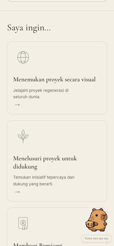
min-h-[200px]) and tighter padding (p-5 vs desktop p-7).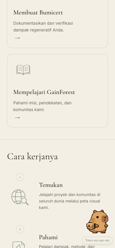
lg (they only make sense in the horizontal layout).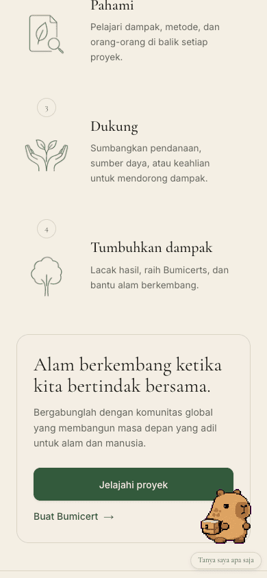
px-6 py-7.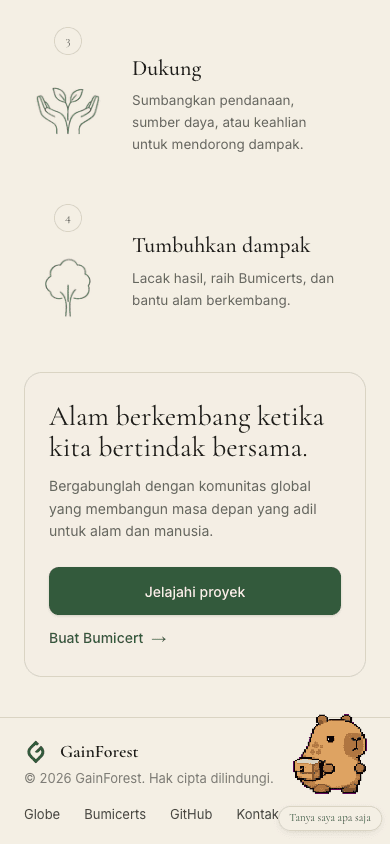
flex justify-between to flex-col; logo + copyright on one row, nav links (Globe / Bumicerts / GitHub / Kontak) wrap on a second row instead of spilling off the right.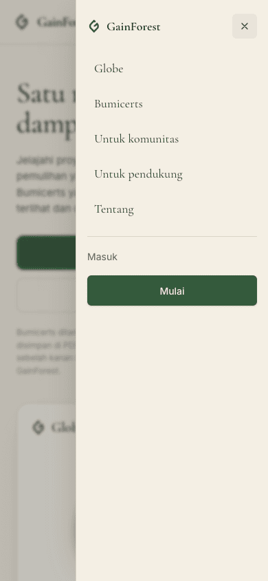
Other breakpoints — sanity
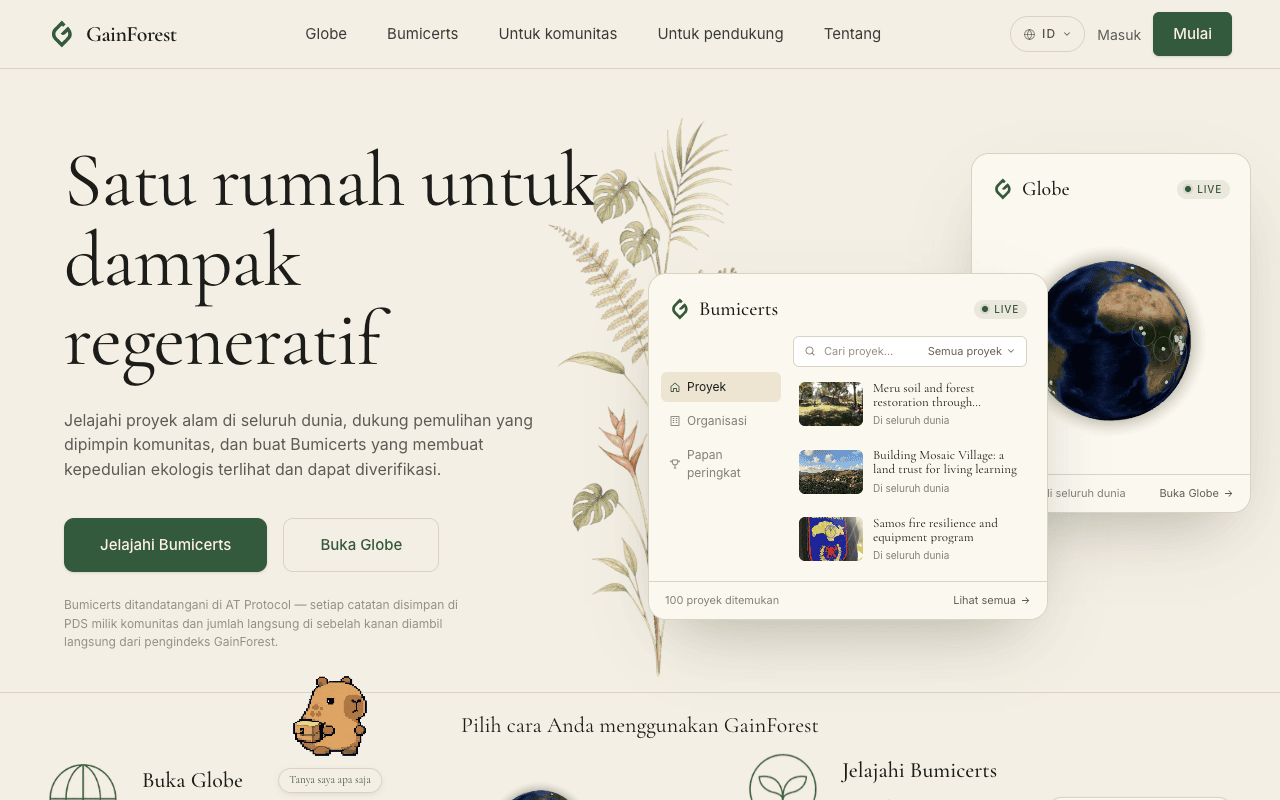
The same component set, rendered at tablet (768 px) and desktop (1280 px) widths. The split point is Tailwind's lg (1024 px): below it everything goes inline, at or above it the floating draggable windows return.
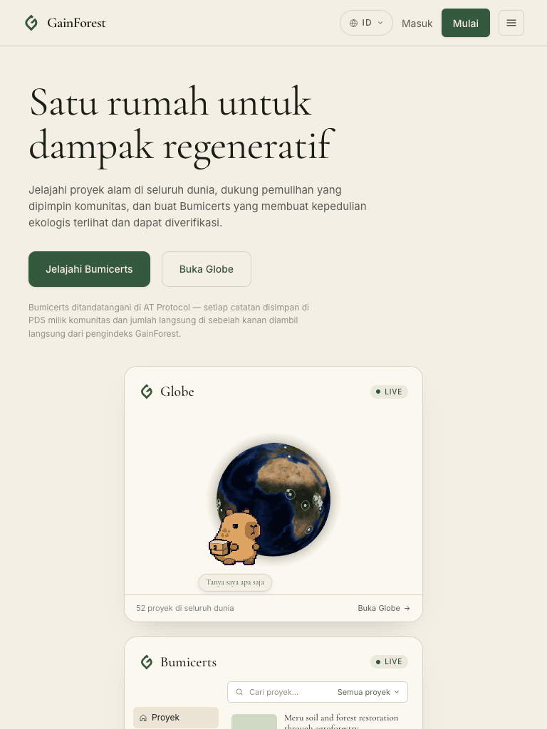
sm:flex-row), inline cards centre at max-w-[420px]. Hamburger is still visible since we're below lg.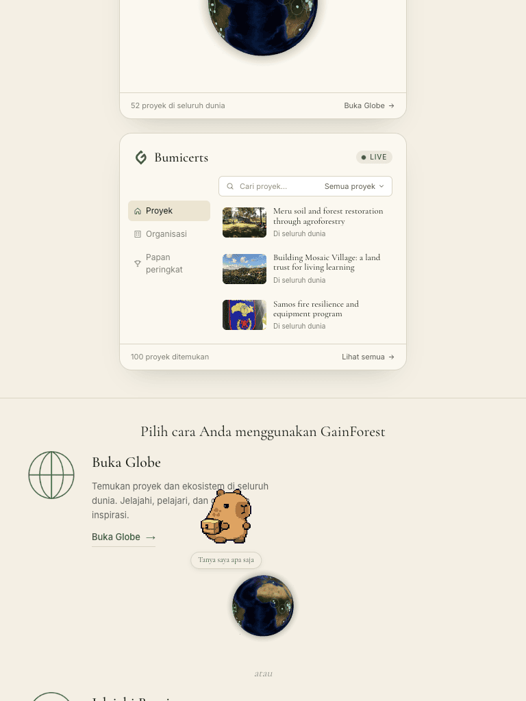
Findings
Hero typography now fits the phone
Headline: text-[42px] sm:text-[58px] lg:text-[78px]. The 42 px mobile size wraps the two i18n lines naturally instead of forcing one-word lines.
Subtitle and footnote also step down (text-[15px] lg:text-[16px] / text-[12px]). Hero padding drops to px-6 pt-10 on mobile vs px-16 pt-16 on desktop.
Live windows render inline on mobile (never hidden)
Both BumicertsCard and DraggableGlobeCard now accept an inline prop. In inline mode they skip the useDraggableDocPos hook, drop position: absolute, and cap to max-width: 420px. The same live data feeds the desktop floating cards and the mobile inline cards — no separate mock.
Composition: app/page.tsx renders both flavours and toggles between them with Tailwind responsive utilities: <div className="hidden lg:block"> for the draggable absolutes; the inline pair is passed to <Hero> via an inlineCards prop and rendered inside the hero column with lg:hidden.
Mobile drawer for the 5 hidden nav links
The desktop navbar's 5 links (Globe / Bumicerts / Untuk komunitas / Untuk pendukung / Tentang) were behind hidden md:flex, which on phones simply hid them with no replacement.
Added a hamburger button (lg:hidden on the trigger, hidden lg:flex on the desktop link strip) that toggles a right-anchored drawer with all five links, the sign-in pill, and the primary CTA. Esc and backdrop-tap close it; body scroll is locked while open. Animation: 180 ms drawerIn keyframe.
Capybara default flips per viewport
Desktop default stays bottom-LEFT (balances the right-weighted hero windows). Mobile default flips to bottom-RIGHT — on a single stacked column a bottom-left mascot constantly overlaps the content stream as you scroll.
Detection: window.innerWidth >= 1024 at first paint. Persisted position survives in localStorage (key bumped to v3 so existing visitors pick up the new default).
Decorative weight tuned for small screens
Hero's leaves bouquet is hidden lg:block now — at 390 px it was taller than the hero and dominated the page. Section vertical padding drops from pt-14 to pt-10 below lg across IWantTo / HowItWorks / NatureCTA / ChoosePath. Section headings step down (text-[32px] sm: text-[40px] lg:text-[44px]).
Footer reflows on narrow screens
Was flex items-center justify-between in a fixed-width row, which spilled "Bumicerts" off the right edge below ~500 px. Now flex-col items-start gap-4 lg:flex-row with the nav links allowed to flex-wrap.
NatureCTA banner buttons stack on mobile
The "Jelajahi proyek" + "Buat Bumicert →" pair was a horizontal flex that crowded against the right edge of the banner. Now flex-col sm:flex-row with the primary button taking full width on phones.
Desktop layout untouched (no regressions)
Every responsive change is gated on lg: utilities so the existing draggable-windows hero, the column-gutter leaves bouquet, the four-step horizontal "How it works" strip, the horizontal footer, and the bottom-LEFT default Capybara are all unchanged at ≥ 1024 px. pnpm exec tsc --noEmit is clean.
Design tokens & class conventions
Everything stays inside the existing design system from app/AGENTS.md — no new colours, no CSS-in-JS, no Tailwind config changes. Mobile work is pure responsive utility classes plus two new constants:
lg = 1024 px (Tailwind default). Below: stacked inline layout. At/above: floating draggable cards.
Hero font scaletext-[42px] sm:text-[58px] lg:text-[78px]
Section heading scaletext-[32px] sm:text-[40px] lg:text-[44px]
Hero paddingMobile px-6 pt-10 → Tablet sm:px-10 → Desktop lg:px-16 lg:pt-16
Inline card max-width420 px (matches the BumicertsCard chrome at desktop width)
Capybara defaultDesktop bottom-LEFT (x=32, y=H-122) · Mobile bottom-RIGHT (x=W-102, y=H-132)
Drawer animationdrawerIn 180ms ease-out — slide-in from translateX(20px) + fade
Reproducing
gainforest/gainforest-app (main)
Target URLhttp://127.0.0.1:3030 (Next 16.1.6, Turbopack, pnpm dev)
Mobile viewportagent-browser set viewport 390 844
Tablet viewportagent-browser set viewport 768 1024
Desktop viewportagent-browser set viewport 1280 800
Type-checkpnpm exec tsc --noEmit (clean)
Walkthrough videomobile-walkthrough.webm (mobile scroll + drawer)
Screenshotsassets/01-before-*.png · assets/10-after-*.png · assets/2x-after-tablet-*.png · assets/30-after-desktop.png