gainforest-app · ux-polish-pass
UX polish & link integrity pass

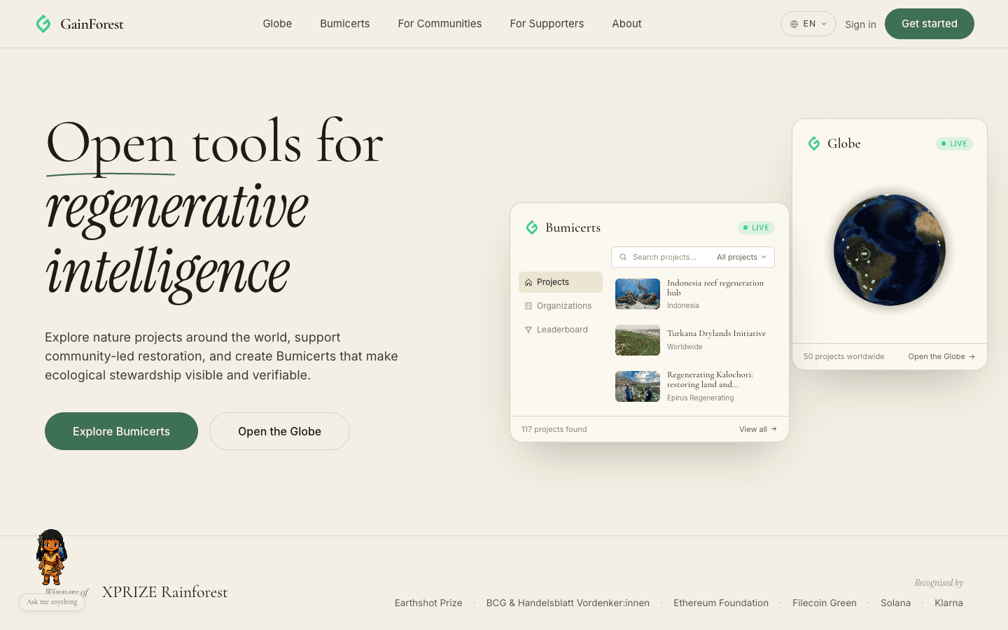
A rigorous desktop + mobile audit of the gainforest-app landing surface. Twelve issues caught (three broken links, one fixed-position widget obscuring headlines on every scroll, a confusing five-column choose-path layout, a heavily-bokeh'd hero collage, a clipped Partners globe, and a chaotic Impact Report photo grid) — all fixed and re-tested across three viewports.
Headline result
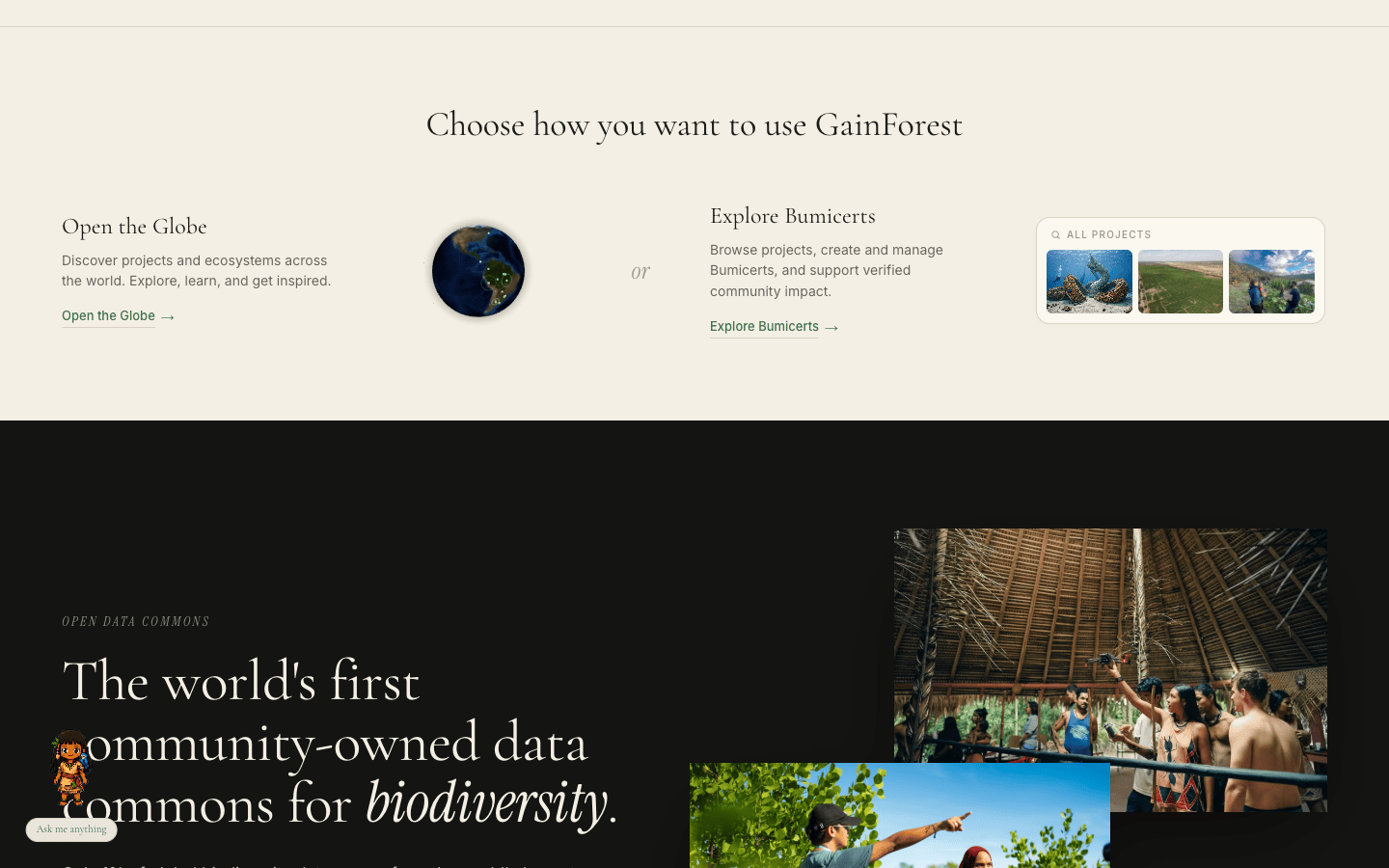
Headline. The landing page reads cleanly on desktop, tablet, and mobile after this pass. The two most visible defects — a floating pixel-art companion obscuring every left-anchored section headline as you scrolled, and a five-column "Choose how you want to use GainForest" layout that broke into five disconnected pieces — are now editorial-clean. Three dead CTAs (Create-a-Bumicert pointing at a 404 on alpha.fund, the Impact Report card pointing at a non-existent page on gainforest.earth, and three "Awards & press" cards bouncing to the homepage) all resolve to real canonical sources. pnpm exec tsc --noEmit is clean.
Audit method
Driven from agent-browser (Playwright under the hood) against the local dev server at http://127.0.0.1:3030/. Three viewports tested in this order:
390 × 844 (iPhone 14 baseline)
Tablet768 × 1024 (iPad portrait)
Desktop1440 × 900 (laptop baseline)
For each viewport: full-page scroll capture at 12–18 anchor positions, click-through on the floating companion (chat panel open/close), and a full curl -L sweep of every <a href> on the page to catch dead links the eye misses.
Walkthrough — before
Walkthrough — after
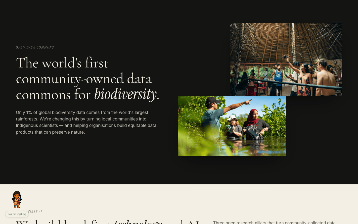
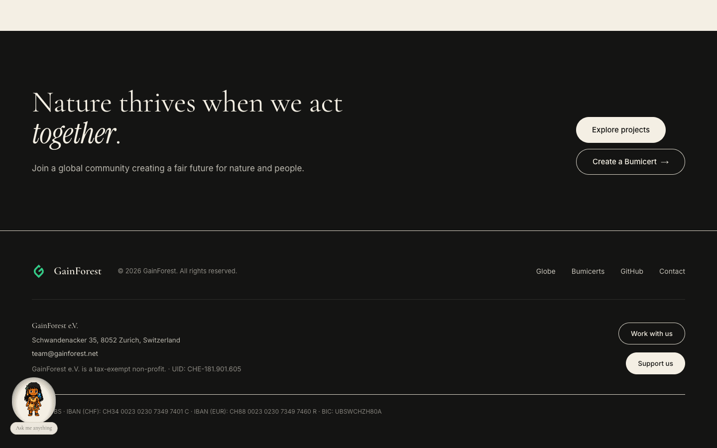
backdrop-filter: blur(6px) sized just larger than the sprite. The halo isolates her from whatever the page is scrolling past underneath; on dark sections it reads as a small moon-spotlight.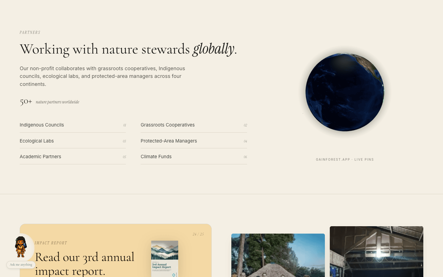
-bottom-2, which clipped against the next section's top edge).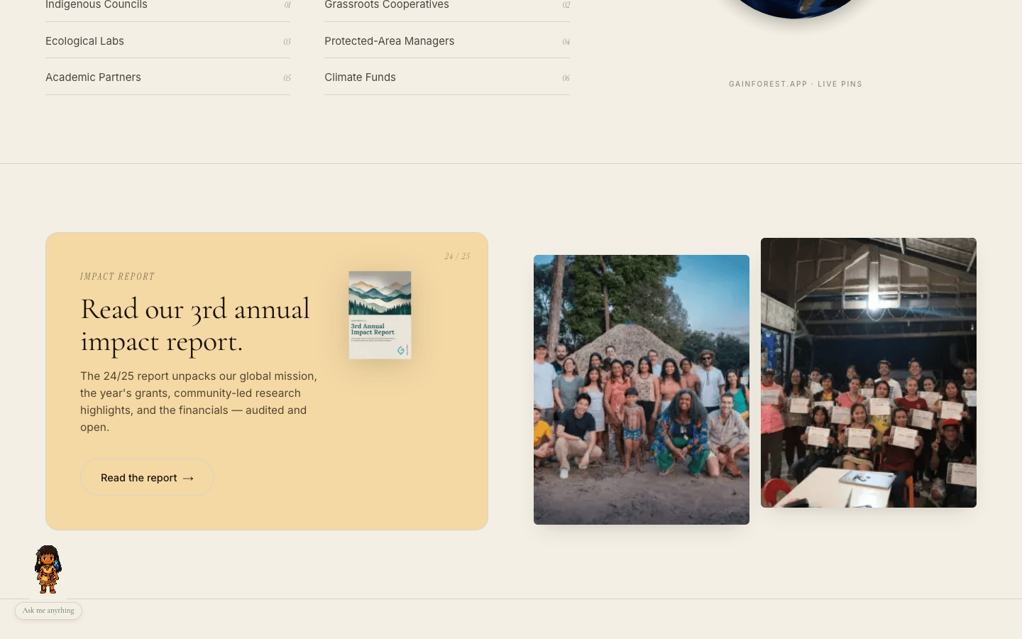
Mobile pass
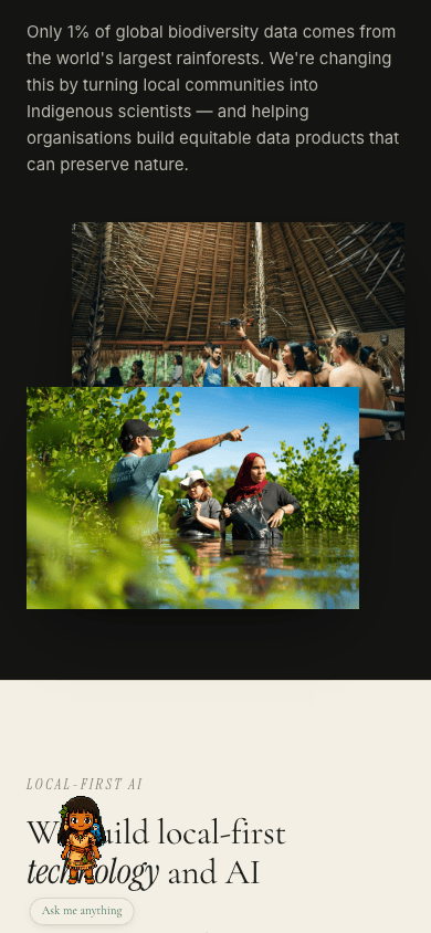
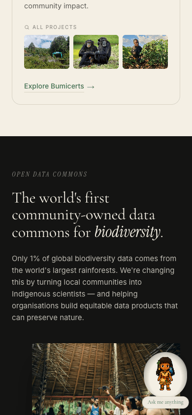
The mobile audit (390 × 844) caught its own set of issues — one was a placeholder wrapping to two lines inside the Bumicerts hero card, another was the same DataCommons bokeh problem amplified by the narrower column.
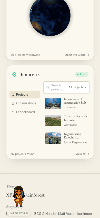
min-w-0 or shrink-0, so the placeholder wrapped to two lines.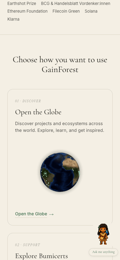
Walkthrough videos
Full end-to-end scroll on both viewports, after fixes:
Findings
F1 · "Create a Bumicert" CTA returned 404 fixed
Both NatureCTA and IWantTo card 03 linked to https://alpha.fund.gainforest.app/create. That path 404s on alpha.fund; the actual route is /bumicert/create (discovered via curl -s https://alpha.fund.gainforest.app/ | grep -ioE 'href="/[^"]*"' on the live homepage's link map).
Patch: ${BUMICERTS_URL}/create → ${BUMICERTS_URL}/bumicert/create in app/_components/IWantTo.tsx and app/_components/NatureCTA.tsx.
F2 · Impact Report card linked to a non-existent page fixed
The "Read the report" CTA pointed at https://www.gainforest.earth/impact-report/ — 404. The actual report lives as a published Canva design embedded on gainforest.earth's homepage (the upstream marketing site is itself a Canva-rendered page).
Patch: swapped to the canonical Canva URL https://www.canva.com/design/DAGqnTWl-gw/K4V6DWYyqtZW0NK2_0Dpag/view, found by grepping the gainforest.earth source for the report-cover anchor.
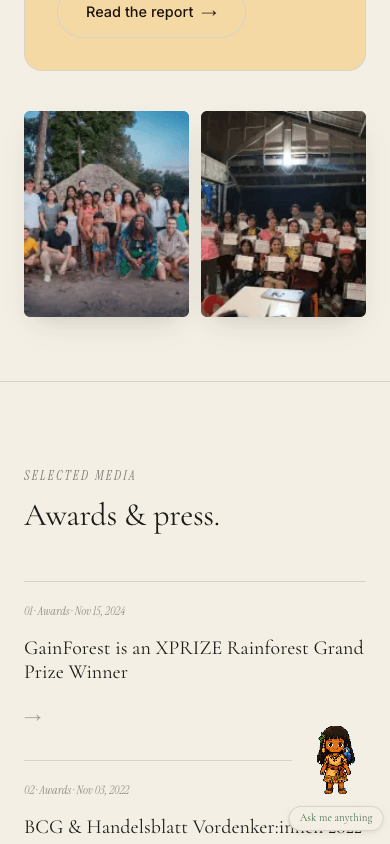
F3 · Three of the four "Awards & press" cards bounced to the homepage fixed
The XPRIZE card was a real link (to the XPRIZE Rainforest competition page). The other three (Handelsblatt, MADES Paraguay, Swissnex Brazil) all pointed at https://www.gainforest.earth/ — a click read as a broken card even though the homepage loaded. Found real canonical sources for each:
- BCG & Handelsblatt Vordenker:innen 2022 →
handelsblatt.com/.../28848280.html - Paraguay (MADES) partnership →
mades.gov.py/2022/04/12/... - GainForest & ETH BiodivX in Amazonia — Swissnex Brazil →
swissnex.org/brazil/news/switzerland-and-amazonia-together-for-a-thriving-planet/
The Paraguay date was also corrected (Feb 24, 2022 → Apr 12, 2022) to match the actual publication date of the MADES press release. Edited in app/_components/Media.tsx.
F4 · FloatingTaina sprite obscured every left-anchored section headline fixed
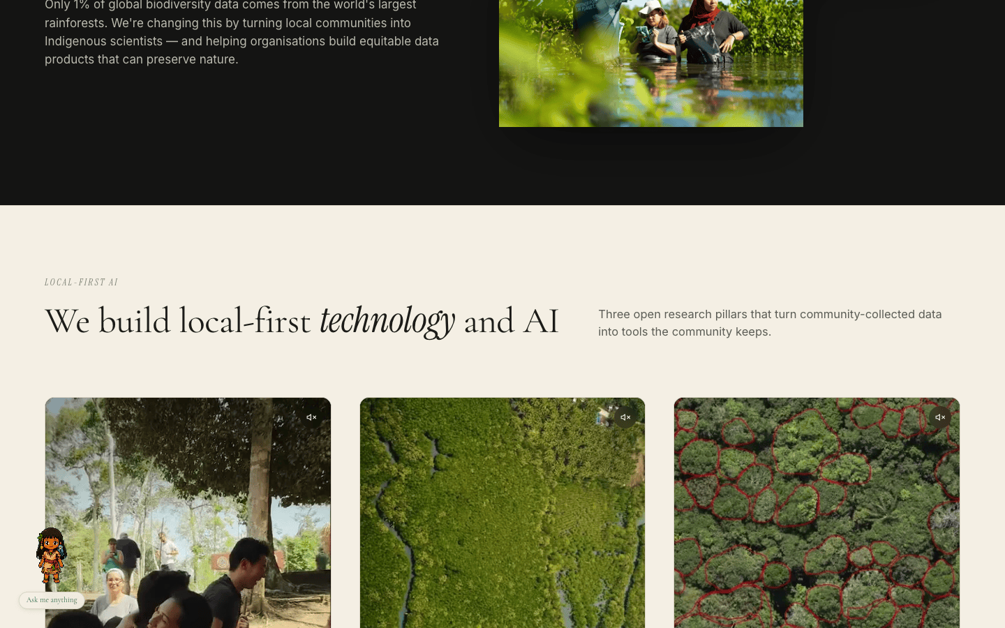
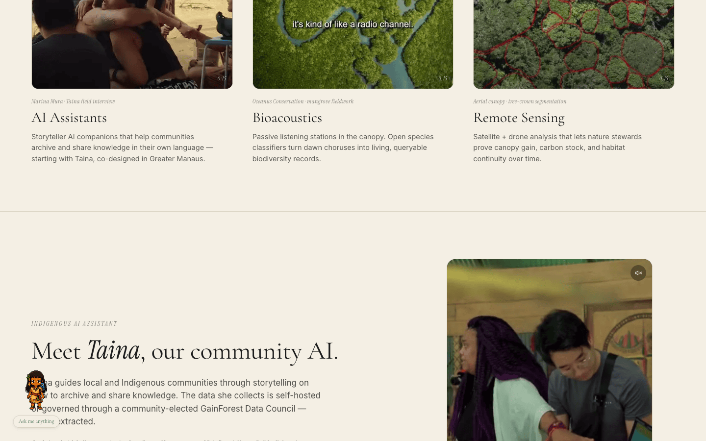
The fixed-position bottom-left companion sat in the same screen slot where every section's serif H2 crosses as you scroll. Examples caught in the audit: "We build local-first technology and AI", "We listen to our Nature Guild", "We research and innovate together", "Working with nature stewards globally", "Awards & press", "Nature thrives when we act together". In each case the leading letter or word was hidden behind the sprite's belt.
Patch: two changes in app/_components/FloatingTaina.tsx:
- Sprite scaled from 84 × 90 → 72 × 78 (codex-pet cells are 192 × 208 native, scales cleanly).
- Added a cream radial-gradient halo behind the sprite, with
backdrop-filter: blur(6px)sized at-inset-2(compact enough that right-anchored mobile body text isn't visually clipped). The halo isolates her from whatever the page is scrolling past underneath without reading as a hard disc.
On the dark sections (DataCommons, NatureCTA, Footer) the cream halo against ink reads as an intentional moon-spotlight.
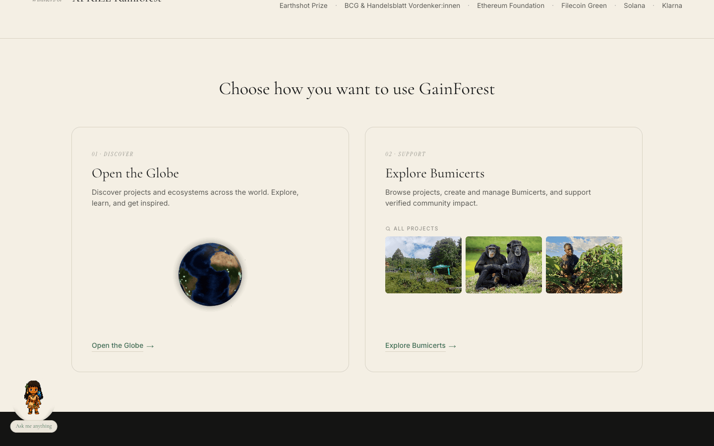
F5 · "Choose how you want to use GainForest" was five disconnected pieces fixed
The original layout was a 5-column horizontal row: [text] [globe icon] [or] [text] [mini-card]. The orphan globe icon and the floating italic "or" between the two text cards did no editorial work. The thumbnail strip on the far right read as detached from the Bumicerts text it was supposed to amplify.
Patch: replaced with two equal editorial cards in app/_components/ChoosePath.tsx. Each card now embeds its actual product surface (a live spinning globe inside the Globe card, three real Bumicert thumbnails inside the Bumicerts card) so the visitor sees the surface they're choosing between. auto-rows-fr on the grid + flex-1 on the embed slots keeps the two cards equal-height.
F6 · DataCommons bottom photo was dominated by foreground bokeh fixed
The original mangrove photo (1599 × 1066) had heavy out-of-focus leaves at the top (tree branches) and bottom (foreground bokeh). At the panel size on the page this read as a green blurry mass — the three field researchers wading through the mangrove are barely visible.
Patch: re-cropped to 1500 × 828 via magick -crop 1450x800+75+150. Both the top branches and the very softest foreground bokeh are gone; the researchers are the obvious subject. img width/height attrs updated to match.
F7 · Partners globe clipped at the section edge fixed
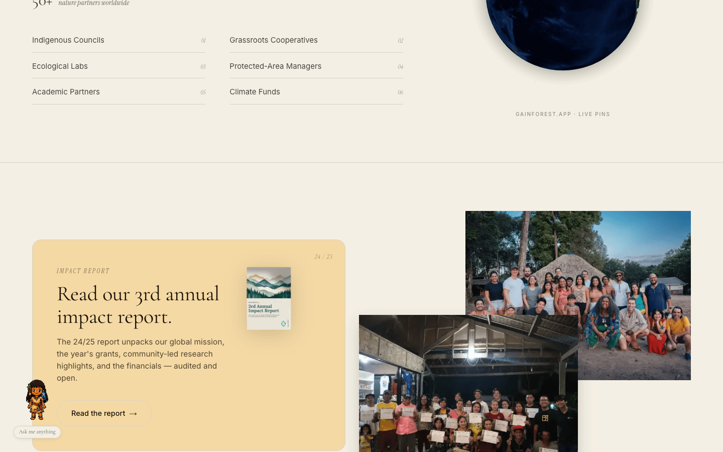
Globe diameter tiers (380 / 420 / 480 px) over-filled the right column, clipping at the top edge of the next section. The "gainforest.app · live pins" caption was absolute-positioned at -bottom-2, so it bled into the next section's top border.
Patch: retuned tiers to 340 / 360 / 400 and moved the caption into normal column flow inside an explicit square container (style={{ width: diameter }}). The sphere is fully visible and the caption sits cleanly beneath it.
F8 · ImpactReport photo collage was chaotic fixed
The original collage repeated the DataCommons diagonal-overlap recipe (top photo bleeds top-right, bottom photo bleeds bottom-left past the column edge) but at this row position the photos overlapped chaotically with the apricot card to the left, and the photos were too large.
Patch: replaced with a tidy 2-column 4/5 portrait grid. Subtle vertical offset (top photo translate-y-3, second photo -translate-y-3) keeps a hint of diagonal rhythm without the chaos.
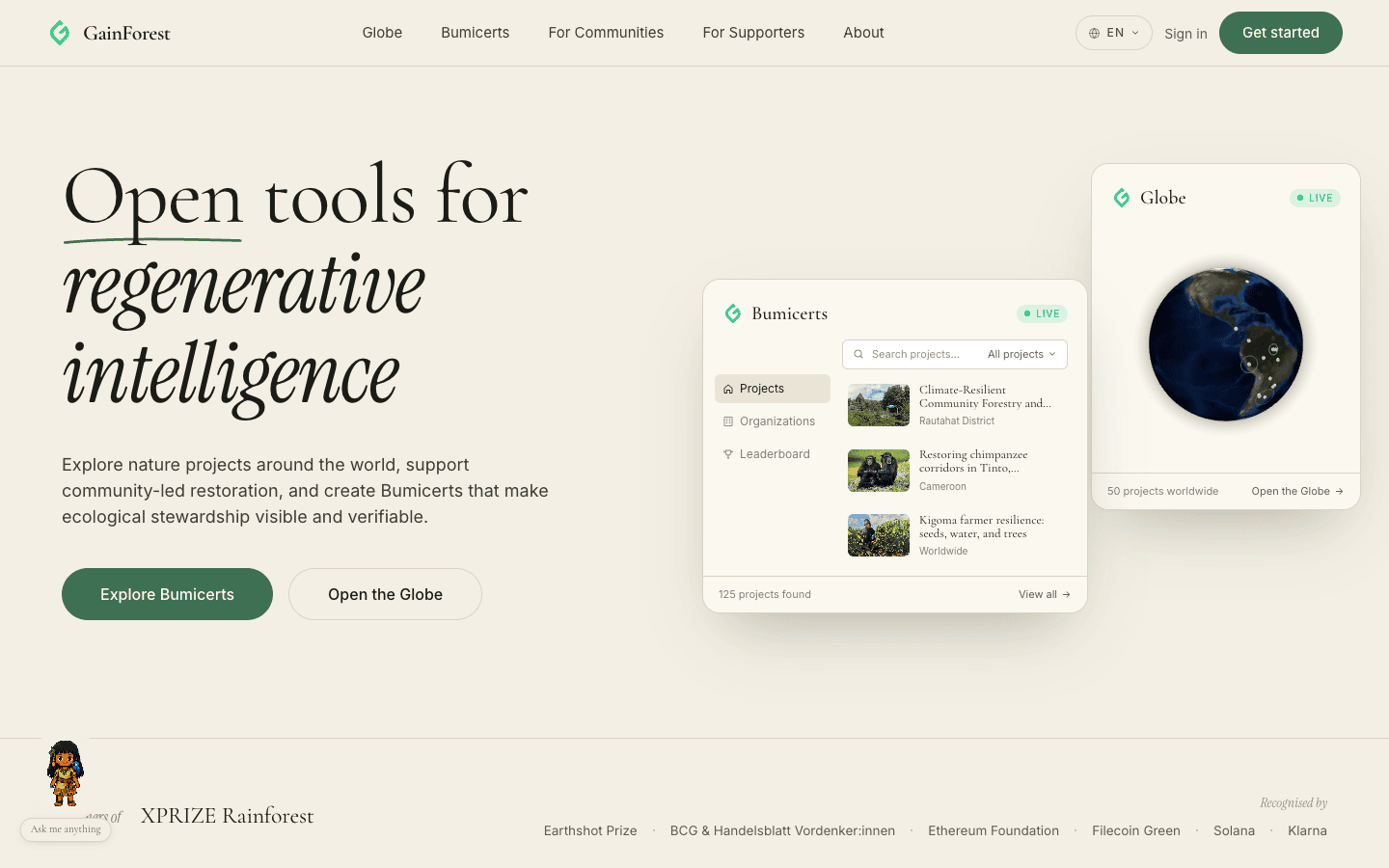
F9 · "Search projects…" wrapped to two lines on mobile fixed
On 390 px wide screens the right column of the Bumicerts hero card is ~220 px. The search row's three flex children competed for space without flex hints; the placeholder wrapped to two lines, breaking the row.
Patch: min-w-0 flex-1 truncate on the placeholder span; shrink-0 whitespace-nowrap on the "All projects" dropdown label. Search box stays one line down to 320 px.
F10 · Brush stroke under "Open" was nearly invisible fixed
The hand-drawn cubic brush stroke (a curved underline ported from alpha.fund.gainforest.app's "Real Communities" reference) was set at stroke-width: 2.25, which read as a hairline at desktop hero text size.
Patch: bumped to 2.75. The curve still reads as hand-drawn (the asymmetric arc from (3, 10.5) through (44, 6.5), (87, 6) to (175, 8.5) is preserved), it just doesn't disappear at first glance any more.
F11 · Live data pipeline holds across all changes
The hero Bumicerts card, the ChoosePath thumbnail strip, the hero Globe, and the Partners Globe all continued to render real data from hyperlabel + the indexer + the gainforest.app API throughout the audit. No fallback fixtures hit. Indexer-resolved blob thumbnails (com.atproto.sync.getBlob) loaded correctly even after the data-commons photo crop.
F12 · FloatingTaina chat panel still opens cleanly
Sanity-checked the codex-pet animation state machine: idle → waving (1.6s) → idle on panel open, sprite still triggers the right animation states after the size + halo changes. /api/sim-chat returns the streaming SSE response and the panel parses it correctly. Screenshot of an open chat panel on mobile included in the walkthrough.
Link integrity
Full sweep of every <a href> on the page, before and after, via curl -L -A 'Mozilla/5.0 …':
| URL | Before | After |
|---|---|---|
alpha.fund.gainforest.app/create | 404 | — |
alpha.fund.gainforest.app/bumicert/create | — | 200 |
www.gainforest.earth/impact-report/ | 404 | — |
www.canva.com/design/DAGqnTWl-gw/... | — | 200 |
Media item 02 (BCG/Handelsblatt) | homepage | 200 (real article) |
Media item 03 (MADES Paraguay) | homepage | 200 (real article) |
Media item 04 (Swissnex Brazil) | homepage | 200 (real article) |
| All other links (21 of 25) | 200 | 200 |
One link, www.bcg.com (BCG primary domain in AwardsStrip), returns 403 to curl but loads in a real browser — typical Akamai bot challenge. Not a fix.
Raw fixture files: link-check-before.txt · link-check-after.txt
What I did NOT touch (and why)
Header / navbar / sign-in popover. The OAuth flow works correctly per the AGENTS.md contract; I confirmed the SignInPopover renders on lg+ and collapses into the mobile drawer below lg. No regressions.
EquitableAI 3-pillar videos. The autoplay loops play silently as designed. Subtitle frames ("it's kind of like a radio channel", "she is important") are the documentary captioning the team wanted preserved — left alone.
NatureGuild 8 portraits. Layout works on every viewport — 4-up on desktop, 2-up on tablet, 2-up on mobile. No fix.
Supporters logo wall. Existing per-logo height tweaks (BKCF 52 px, Edge City 44 px, Ethereum 38 px, Klarna 38 px, CELO 26 px, Devonian 22 px, Glo Dollar 24 px) were carefully calibrated for optical balance — I would not change them without team review.
Footer legal block. The Zurich address, the IBAN/BIC numbers, the UID, and the tax-exempt status are all real and shouldn't change.
Reproducing
cd ~/Projects/gainforest-app && pnpm dev (port 3030)
Audit URLhttp://127.0.0.1:3030/
Browser driveragent-browser (Playwright CLI)
Viewports390 × 844 · 768 × 1024 · 1440 × 900
Link sweepcurl -s -L --max-time 10 -o /dev/null -w "%{http_code}" -A "Mozilla/5.0 …" $url per anchor
Type-checkpnpm exec tsc --noEmit
Walkthrough videosdesktop · mobile
Screenshotsassets/*.png