
Eval Wiki · educator audit · round 4
Test Report v4
Round 4 aligns the landing page with the wiki’s organising principle. The validity frame (Messick’s six validities × civic-AI pipeline stage) is now the primary orientation device on the home screen, with §1–§11 demoted to a secondary "Other ways in" list. Wide hub pages also opt into a wide: true layout that drops the sticky sidebar so reference grids breathe.
What changed in round 4
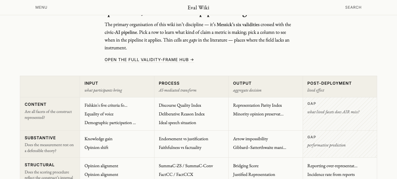
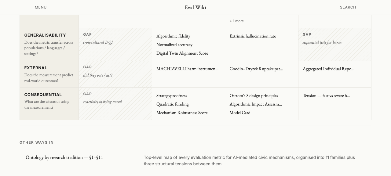
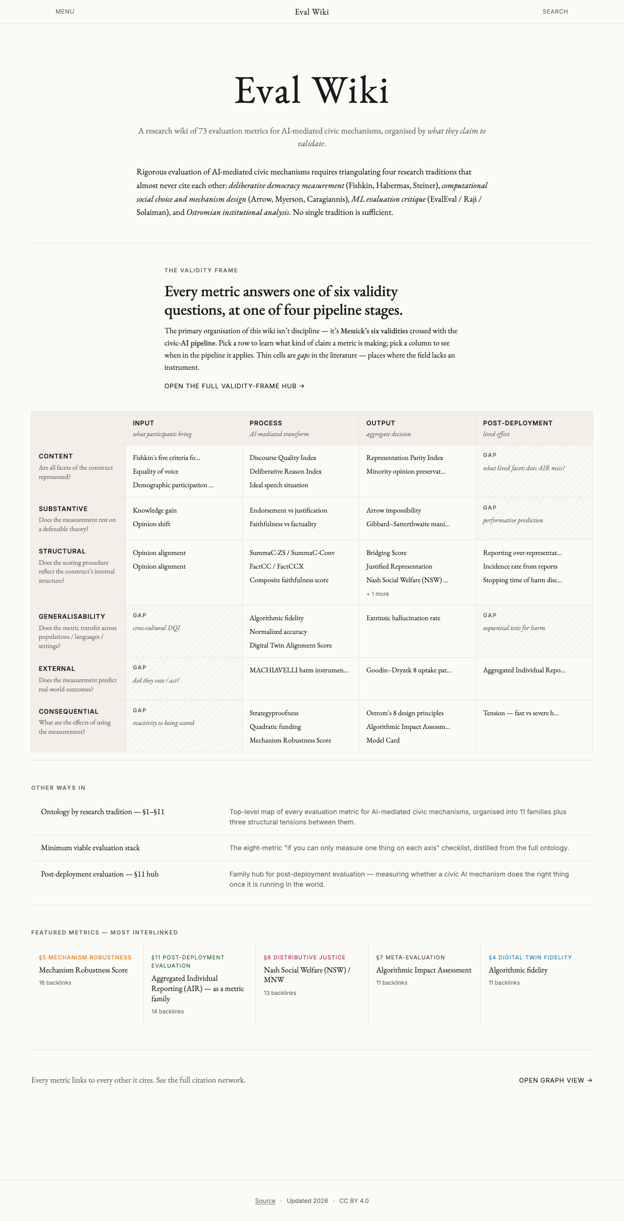
- Landing page restructured around the validity frame. A mirrored 6×4 grid is now the primary content of the home page, with every cell showing up-to-3 clickable metric links or a GAP marker with a one-line description for empty cells.
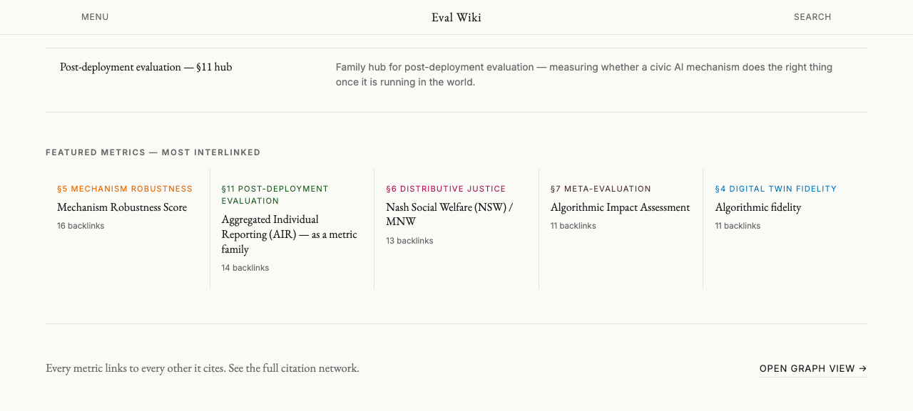
- §1–§11 ontology demoted to a secondary "Other ways in" list alongside the MVE stack and the §11 post-deployment hub.
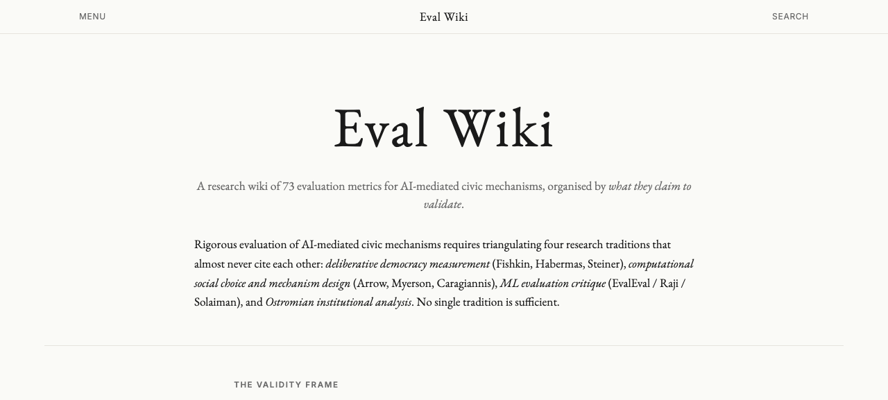
- Hero rewritten with a new tagline (“A research wiki of 73 evaluation metrics for AI-mediated civic mechanisms, organised by what they claim to validate.”) that primes the educator before they see the grid.
- Wide hub layout added via a new
wide: truefrontmatter flag. Pages that opt in (currently_validity-frameandaggregated-individual-reporting) stretch the content area to 1400 px and move the sidebar to a horizontal strip below the content, so the Messick × pipeline grid actually fits. - Table styling for markdown tables on any page: header row in small-caps, alt-bg first-column labels, single-line slug rendering with horizontal scroll if needed.
- Body-H1 fix — the PageLayout now wraps the slotted markdown body in
.page-proseand hides its first<h1>(the frontmatter title already renders in the hero). Fixes the regression where the EvalCard component caused the:first-childselector to stop matching.
Landing page — validity frame as the organising lens
The previous landing page led with an 11-card family grid of §1–§11, which in practice contradicts the wiki’s own critique of that grouping (filed at /queries/critical-review-of-metric-families/). The new landing page inverts this: the validity frame is the organising principle, §1–§11 is a historical cross-index.
Construct-validity page — unchanged, passes UX
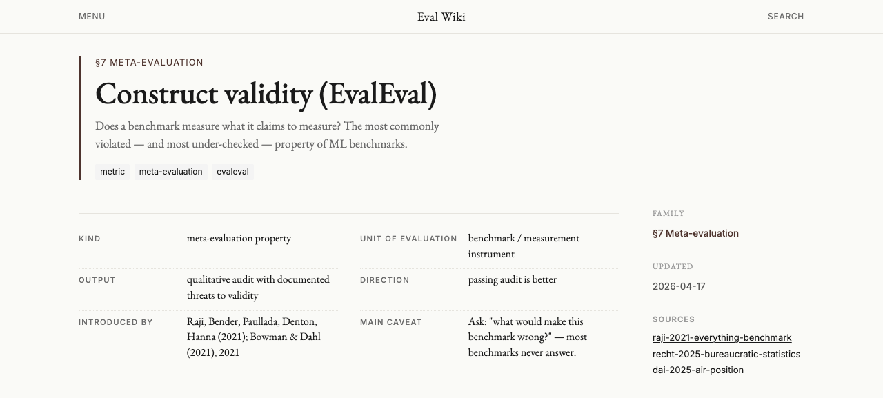
/construct-validity/ page (in §7 Meta-evaluation) after the merge: single H1, one-sentence summary, structured eval card (Kind / Unit / Output / Direction / Introduced by / Main caveat), sidebar with Family / Updated / Sources. Body prose at comfortable width. Nothing needed to change here.Validity-frame page — wide layout fixes the grid
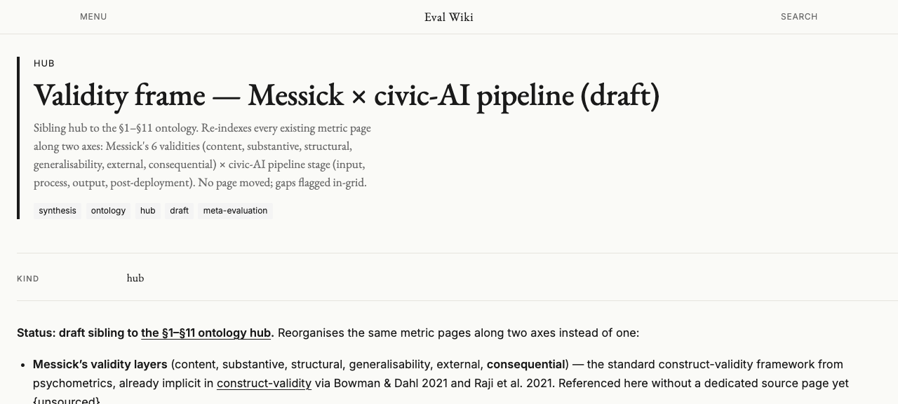
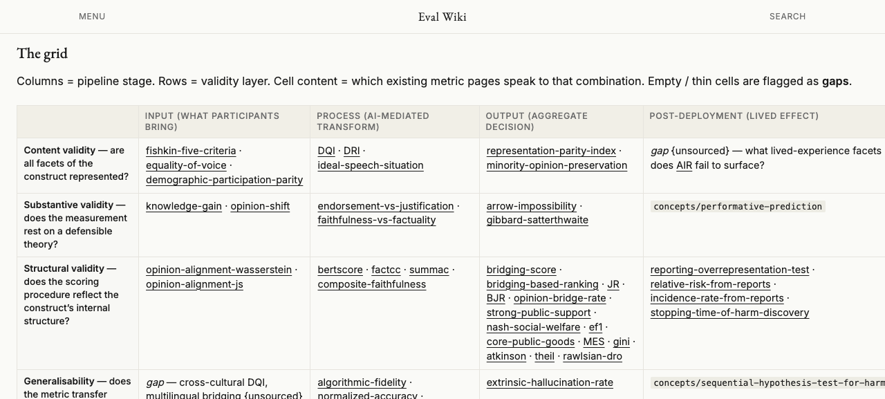
The /validity-frame/ hub hosts the full 6×4 Messick × pipeline grid (not the summarised version on the landing page). Round 3 dropped this into the standard narrow-prose layout, which crushed a 4-column reference table into 62ch — every cell wrapped to 4–8 lines and slug names split mid-word. Round 4 adds a wide: true frontmatter flag that opts hub pages with tables into a 1400px content area with the sidebar moved to a horizontal strip below.
Educator-perspective checks
Ten-second rule: can a student name the organising principle?
Yes. Within the first scroll, a student reads “A research wiki of 73 evaluation metrics for AI-mediated civic mechanisms, organised by what they claim to validate” and then sees a labelled 6-row × 4-column grid titled “Every metric answers one of six validity questions, at one of four pipeline stages.” The framing is explicit and repeated.
Gaps are first-class on the landing page
Six of the 24 cells are flagged as GAP with a one-line description (“cross-cultural DQI”, “did they vote / act?”, “reactivity to being scored”, “sequential tests for harm”, “performative prediction”, “what lived facets does AIR miss?”). Diagonal-hatched background makes them visually distinct. A student immediately sees where the field’s literature is thin.
Every cell is a ramp, not a dead end
Each grid cell contains up-to-3 clickable metric links (truncated to 26 characters for visual rhythm) and a “+ N more” counter when the actual validity-frame hub has more. From the landing page a student can get to every populated metric in two clicks.
§1–§11 still reachable
The “Other ways in” list explicitly surfaces “Ontology by research tradition — §1–§11” alongside the MVE stack and the §11 post-deployment hub. Students who arrive with a family-first mental model from a course syllabus still have a landing on that structure, one click away.
Hub tables no longer crushed into 62ch prose
wide: true on _validity-frame.md and aggregated-individual-reporting.md stretches the content area, moves the sidebar to a horizontal strip at the bottom, and relaxes the prose-width constraint. The 6×4 grid on the hub page is legible. Regular metric pages (e.g. Bridging Score, Gini, AIR) that don’t have wide content stay in the 62ch editorial layout.
Landing-page grid is a hand-maintained mirror of _validity-frame.md
The grid on the landing page is encoded in a TypeScript GRID constant in src/pages/index.astro. If the validity-frame hub page gains a new metric, that new entry won’t show on the landing page unless someone updates the mirror. Acceptable for now (the grid is small) but a future polish would be to parse _validity-frame.md’s markdown table at build time and generate the landing-page grid from it.
Long titles in grid cells truncate to 26 chars
This is intentional (readability) but means “Mechanism Robustness Score” displays as “Mechanism Robustness Score” (exactly 26) and “Aggregated Individual Reporting (AIR) — as a metric family” displays as “Aggregated Individual Repo…”. Clicking still navigates correctly; the full title shows on the destination page.
Files changed in round 4
wiki/frontend/src/pages/index.astro
  — full rewrite: hero simplified, validity-frame grid added as primary
    content, §1–§11 family grid removed, “Other ways in” list
    replaces the family grid, featured row kept.

wiki/frontend/src/content/config.ts
  — add optional `wide: boolean` frontmatter flag.

wiki/frontend/src/pages/[slug].astro
  — pass `wide` through to PageLayout.

wiki/frontend/src/layouts/PageLayout.astro
  — `isWide = wide === true` (previously `family === 'hub'`)
  — wrap slot in `.page-prose` so the hide-first-H1 rule matches again
  — calm H2/H3 sizes on prose; 62ch max-width; inline code styling
  — wide layout: 1400px content, grid columns 1fr (no sidebar),
    sidebar moved to a flex row below with auto-fit columns
  — table styling: header-row small-caps, alt-bg first column,
    single-line slug rendering, horizontal scroll when needed

wiki/pages/synthesis/_validity-frame.md
  — add `wide: true` frontmatter

wiki/pages/synthesis/aggregated-individual-reporting.md
  — add `wide: true` frontmatter