simocracy-v2 · gathering-resize-parity
Gathering worlds — FtC SF resize parity

A resize audit comparing /ftc-sf and a generic gathering world after making GatheringWorld use the same canvas measurement strategy as TowerWorld.
Headline result
Pass. At desktop, tablet, and narrow mobile widths, the FtC SF tower page and the generic gathering page now report identical canvas backing-store dimensions, CSS canvas dimensions, and sidebar rectangles. Both worlds resize from the page wrapper's measured bounding rect on mount and window.resize.
Screen recording
This recording starts on /ftc-sf, changes the viewport from 1440×900 → 1024×760 → 720×760, then repeats the same resize sequence on the Flourishing Floor gathering route.
Measured parity
| Viewport | FtC SF canvas | Gathering canvas | FtC SF sidebar | Gathering sidebar | Result |
|---|---|---|---|---|---|
1440×900 | x=0 y=56 w=1440 h=844 | x=0 y=56 w=1440 h=844 | x=720 y=56 w=720 h=844 | x=720 y=56 w=720 h=844 | match |
1024×760 | x=0 y=56 w=1024 h=704 | x=0 y=56 w=1024 h=704 | x=512 y=56 w=512 h=704 | x=512 y=56 w=512 h=704 | match |
720×760 | x=0 y=56 w=720 h=704 | x=0 y=56 w=720 h=704 | x=0 y=56 w=720 h=704 | x=0 y=56 w=720 h=704 | match |
Raw measurements are committed as assets/resize-audit.json.
Side-by-side resize evidence
1440×900 desktop
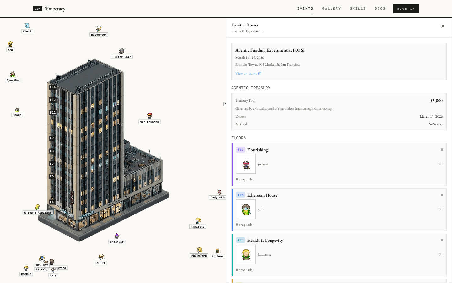
1440×844, sidebar 720×844.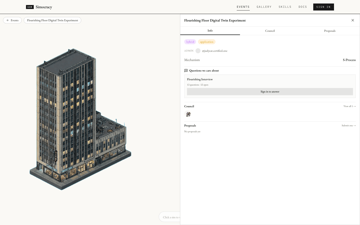
1440×844, sidebar 720×844.1024×760 tablet-width
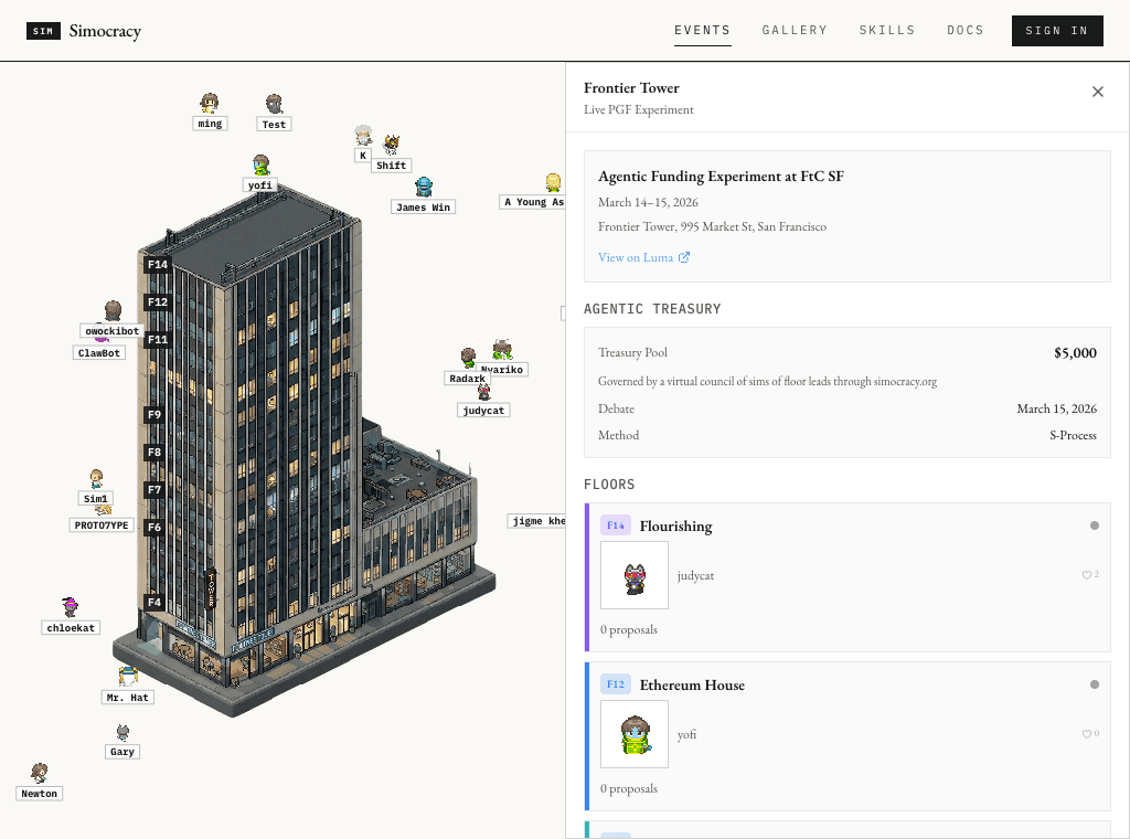
1024×704, sidebar 512×704.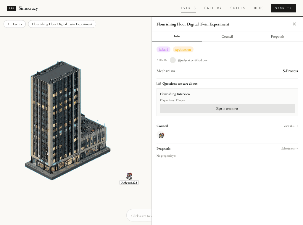
1024×704, sidebar 512×704.720×760 narrow
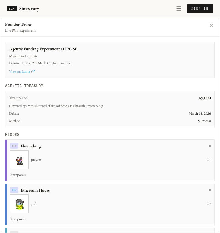
720×704, full-width sidebar 720×704.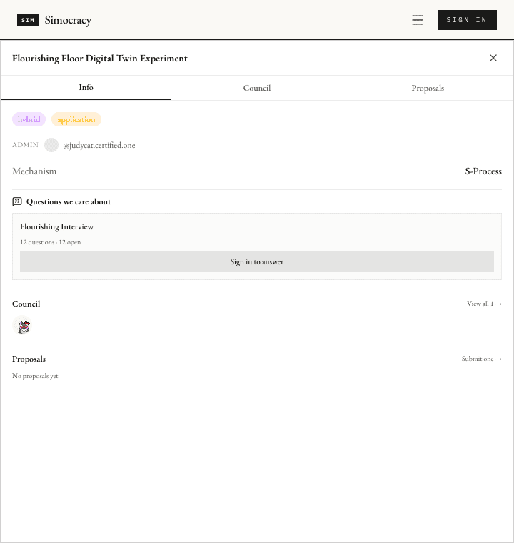
720×704, full-width sidebar 720×704.Findings
GatheringWorld now measures like TowerWorld
The previous gathering implementation used a ResizeObserver with an 800×680 initial state. It now mirrors TowerWorld: initial 960×540, then getBoundingClientRect() on mount and window.resize to set the canvas backing dimensions.
Canvas backing store and CSS size stay in lockstep
The measured canvas.width/canvas.height attributes match the CSS rect at every tested viewport, just like FtC SF.
Sidebar follows the same responsive breakpoints
At md and wider, both sidebars are exactly half-width. Below md, both become full-width overlays while keeping top and bottom aligned to the viewport.
Reproducing
git checkout 880a955 && npm run build && npm run start
Routes/ftc-sf and /events/did%3Aplc%3A4a4ekfv5ks66ogf52xh5u5mg/3mk6xwaltgs22
Viewport commandsagent-browser set viewport 1440 900, 1024 760, 720 760
Videoassets/resize-parity-tour.webm
Screenshotsassets/01-ftc-1440.png through assets/06-gathering-720.png
Checksnpx tsc --noEmit, npx eslint components/events/gathering-world.tsx, and npm run build passed.